
Image Text Component
The Image Text block combines an image with editorial content in a two-column layout. It lets you define a title, text, background color, text color, image position, corner radius, width, animations and a call-to-action button — making it one of the most versatile blocks for product, service and institutional communication pages.
General information
The Image Text block is the primary solution for creating two-column sections with an image and text side by side. It is suited for product presentations, service arguments, institutional content or any scenario where an image and an editorial block need to work together in a balanced composition.
Each block can include:
- title and text with rich text formatting
- image with width, corner radius and left/right position controls
- text and background colors configurable per block
- call-to-action button with label, URL, target and style
- individual animations for image and text
- carousel support with settings per breakpoint
Use this component when you need to present structured information with direct visual appeal, while retaining the editorial flexibility to adjust the composition to different page contexts.
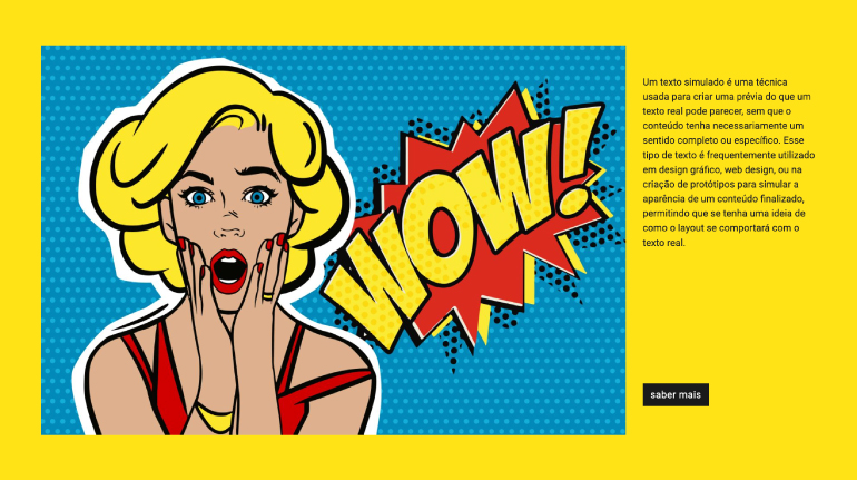
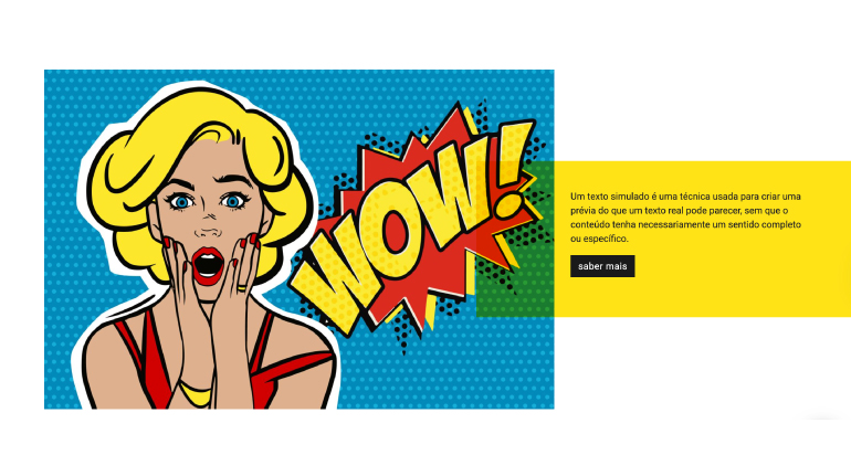
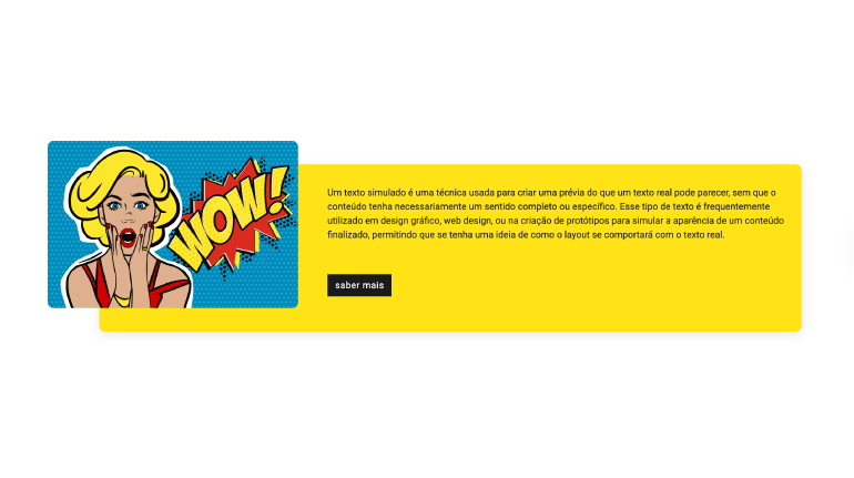
Visual examples of the block
Layout and composition variations
The Image Text block can take on distinct visual readings depending on the combination of Image on the right, Image Width, Background color, Button Style and Image Animation Type. The slideshow below uses real backoffice screenshots to show different ways of configuring this component.
When to use / When to avoid
Correct application of the component
When to use
- To present a product, service or argument with image and text in parallel
- When the content needs a call to action linked to the visual message
- To create alternating rhythm on the page by flipping the image position between blocks
- When a background color helps segment page sections without using dividers
- For institutional, campaign or team presentation content
When to avoid
- When the image has no direct relationship with the text displayed alongside it
- If the goal is to show multiple images — prefer Gallery or Mosaic instead
- When the text is very long and loses readability when compressed into a single column
- If the image is purely decorative without reinforcing the editorial message
How to use in practice
Recommended configuration workflow
1. Editorial content
- Fill in the Title with the section's main message
- Write the Text with the supporting argument or detail
- Set Text color and Background color if the section has its own visual identity
2. Image
- Upload the Image and fill in the ALT field with a relevant description
- Set Image Width to control the proportion of the image column (default: 75%)
- Adjust Image border radius if you want rounded corners
- Use Image on the right to flip the composition
3. Call-to-action button
- Fill in Label button with clear and direct action text
- Set the destination in URL or select an internal Category/Page
- Choose the Target (Self or New Page) and the Button Style
- Use Button Alignment to align the button with the text composition
4. Animations and finishing
- Set Image Animation Type for the image entrance
- Set Text Animation Type for the text block entrance
- Test the result on desktop and mobile before publishing
Content best practices
Editorial and SEO guidelines
Title and text
- The title should be direct and reflect the section's main argument
- The text should complement the image, not describe what is already visible
- Avoid very long paragraphs — column space is limited
- Use rich text for bold and lists when they help to structure the information
Image and accessibility
- The ALT field should describe what the image represents, not the block's context
- Use images with a proportion suited to the width defined in Image Width
- If the image has a white background, consider using Image border radius to soften the transition
- Alternate the image position between consecutive blocks to create reading rhythm
Advanced component settings
Structure, spacing, carousel and global styles
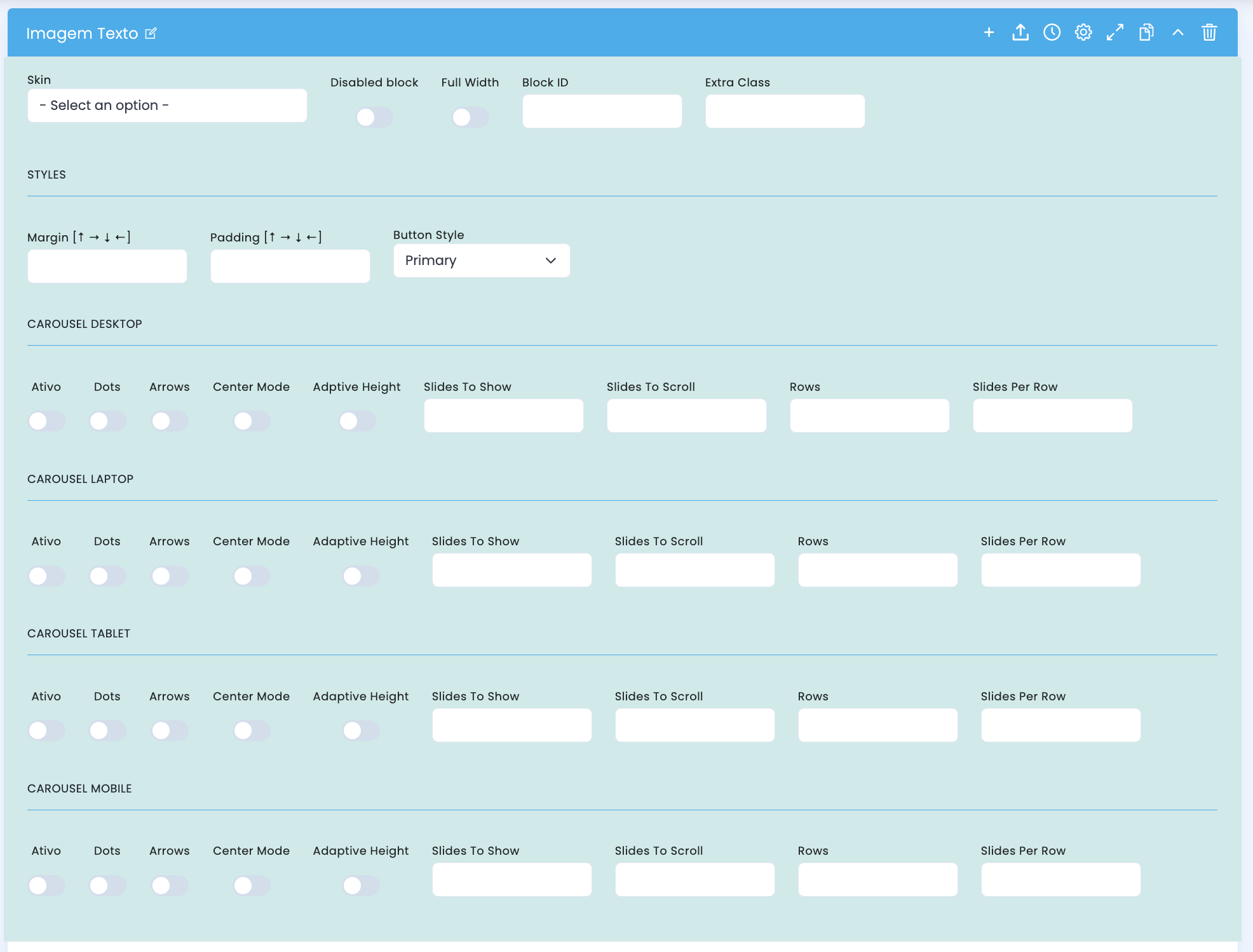
Advanced settings panel — includes structural options, spacing, global button style and carousel settings per breakpoint.
Structural configuration
- Skin chooses a visual variant of the block
- Disabled block disables the block without deleting it
- Full Width makes the block occupy the full available width
- Block ID sets a unique ID for anchor or internal navigation
- Extra Class adds a specific class for additional adjustments
Spacing and button
- Margin controls the outer spacing of the block on all four sides
- Padding controls the inner spacing of the block on all four sides
- Button Style sets the global button style for this block's call to action (default: Primary)
Carousel — Desktop / Laptop / Tablet / Mobile
- Active enables carousel mode for the breakpoint
- Dots shows position indicators
- Arrows shows navigation arrows
- Center Mode centers the active slide with partial visibility of adjacent ones
- Adaptive Height adjusts the height to the active slide
- Slides To Show, Slides To Scroll, Rows and Slides Per Row define the visible items grid
Main content configuration
Title, text, image, colors and call-to-action button
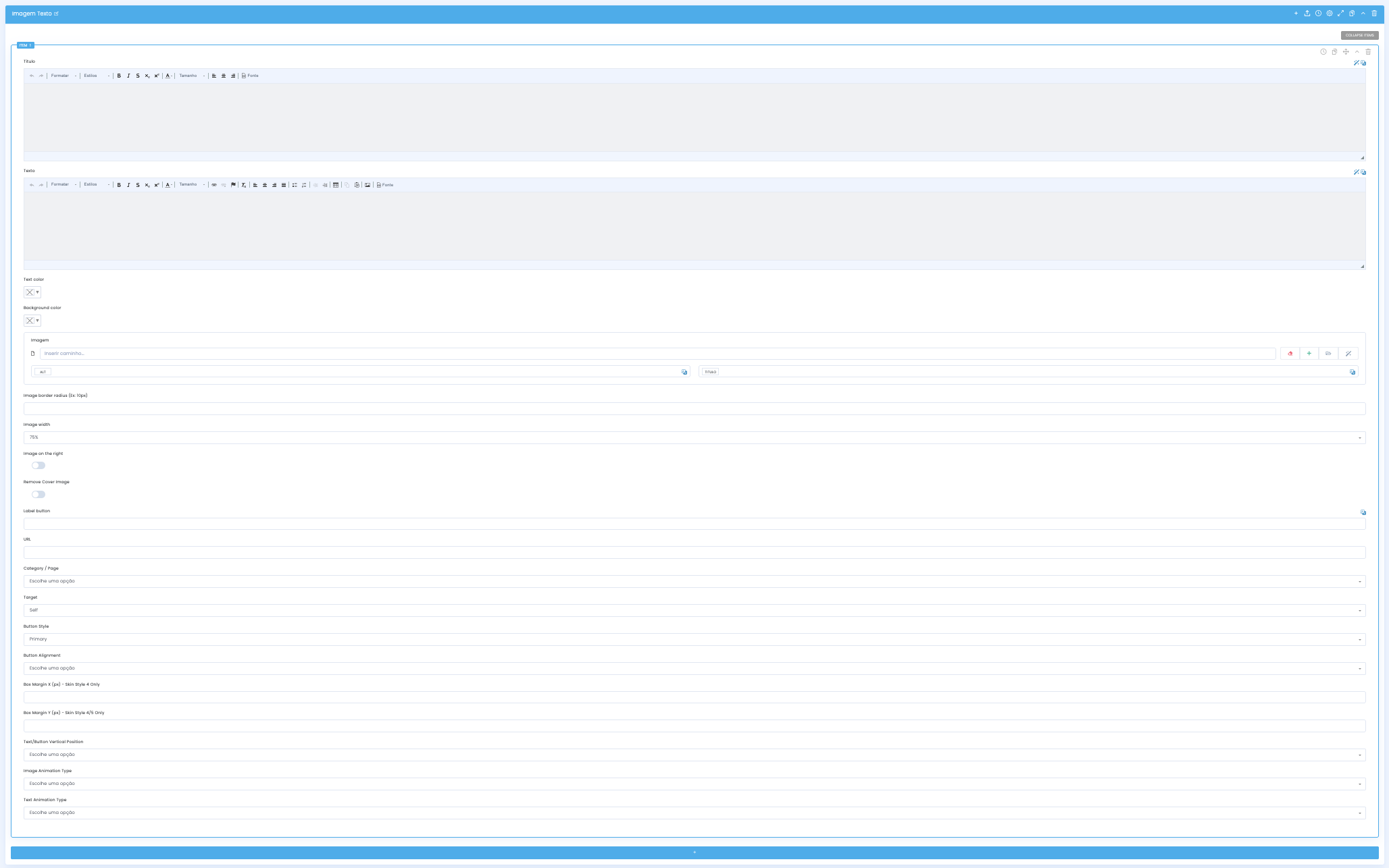
In the main configuration you define the editorial content, image and call-to-action button that make up the section.
Editorial content
- Title receives the section heading in rich text
- Text receives the editorial body with support for advanced formatting
- Text color sets the text color for control over dark or colored backgrounds
- Background color sets the background color of the block section
Image
- Image receives the visual asset for the column and its associated ALT field
- Image border radius sets the corner rounding of the image (e.g. 10px)
- Image width controls the relative width of the image column (default: 75%)
- Image on the right flips the image position to the right column
- Remove Cover Image removes the cover behavior from the image
Call-to-action button
- Label button sets the button text
- URL sets the button destination as an external address
- Category/Page allows selecting an internal CMS destination
- Target controls how it opens: Self or New Page (default: Self)
- Button Style sets the visual style of the button for this block
- Button Alignment aligns the button relative to the text block
Skin-specific options
- Box Margin 4 [px] controls box spacing — available in Skin Style 4 only
- Box Margin Y [px] controls vertical box spacing — available in Skin Styles 4 and 5 only
- These fields are only visible when the corresponding Skin is selected
Presentation and interaction settings
Vertical position, entry animations
Once content and image are defined, adjust the vertical alignment and entry animations for each element of the block.
Vertical position
- Text/Button Vertical Position controls the vertical alignment of the text and button block within the column
- Useful when the image is taller than the text and you want to center or align the editorial content
Image animation
- Image Animation Type sets the type of entry animation applied to the image column
- The animation is triggered when the block enters the viewport during scroll
- Use subtle animations to avoid distracting from the editorial message
Text animation
- Text Animation Type sets the type of entry animation applied to the text and button column
- It can differ from the image animation to create a sequential entry effect
- Avoid combining very different animations that create visual dissonance
Demo & Downloads
Examples and configurations