
Componente Imagem Texto
O bloco Imagem Texto combina uma imagem com conteúdo editorial numa composição de duas colunas. Permite definir título, texto, cor de fundo, cor do texto, posição da imagem, raio de canto, largura, animações e um botão de ação — tornando-o um dos blocos mais versáteis para páginas de produto, serviço e comunicação institucional.
Informações gerais
O bloco Imagem Texto é a solução principal para criar secções de duas colunas com imagem e texto lado a lado. É indicado para apresentações de produto, argumentos de serviço, conteúdo institucional ou qualquer momento em que uma imagem e um bloco editorial precisam de trabalhar em conjunto numa composição equilibrada.
Cada bloco pode incluir:
- título e texto com formatação rich text
- imagem com controlo de largura, raio de canto e posição esquerda/direita
- cores de texto e fundo configuráveis por bloco
- botão de chamada à ação com label, URL, target e estilo
- animações individuais para imagem e texto
- suporte a carousel com configurações por breakpoint
Utilize este componente quando precisa de apresentar informação estruturada com apelo visual direto, mantendo a flexibilidade editorial de ajustar a composição a diferentes contextos de página.
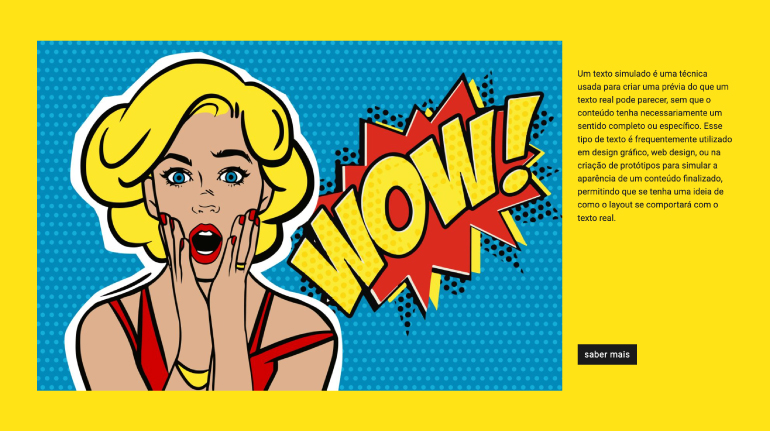
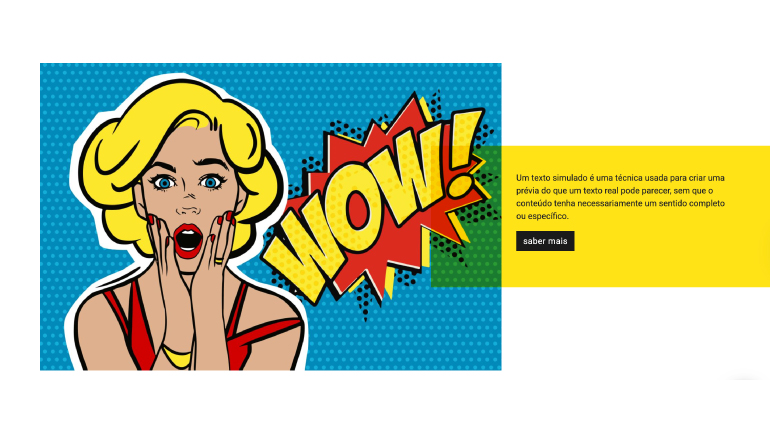
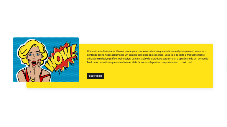
Exemplos visuais do bloco
Variações de layout e composição
O bloco Imagem Texto pode assumir leituras visuais distintas consoante a combinação de Image on the right, Image Width, Background color, Button Style e Image Animation Type. O slideshow abaixo usa capturas reais do backoffice para mostrar diferentes formas de configurar este componente.
Quando usar / Quando evitar
Aplicação correta do componente
Quando usar
- Para apresentar um produto, serviço ou argumento com imagem e texto em paralelo
- Quando o conteúdo precisa de uma chamada à ação associada à mensagem visual
- Para criar ritmo alternado na página, invertendo a posição da imagem entre blocos
- Quando a cor de fundo ajuda a segmentar secções da página sem usar separadores
- Para conteúdo institucional, de campanha ou de apresentação de equipa
Quando evitar
- Quando a imagem não tem relação direta com o texto apresentado ao lado
- Se o objetivo é mostrar múltiplas imagens — prefere Galeria ou Mosaico
- Quando o texto é muito extenso e perde a leitura ao ser comprimido numa coluna
- Se a imagem é puramente decorativa sem reforço da mensagem editorial
Como usar na prática
Fluxo de configuração recomendado
Conteúdo editorial
- Preenche o Título com a mensagem principal da secção
- Redige o Texto com o argumento ou detalhe de suporte
- Define Text color e Background color se a secção tem identidade visual própria
Imagem
- Carrega a Imagem e preenche o campo ALT com descrição relevante
- Define Image Width para controlar a proporção da coluna de imagem (padrão: 75%)
- Ajusta Image border radius se queres cantos arredondados
- Usa Image on the right para inverter a composição
Botão de ação
- Preenche Label button com texto de ação claro e direto
- Define o destino em URL ou seleciona uma Category/Page interna
- Escolhe o Target (Self ou New Page) e o Button Style
- Usa Button Alignment para alinhar o botão à composição do texto
Animações e acabamentos
- Define Image Animation Type para a entrada da imagem
- Define Text Animation Type para a entrada do bloco de texto
- Testa o resultado em desktop e mobile antes de publicar
Boas práticas de conteúdo
Orientações editoriais e de SEO
Título e texto
- O título deve ser direto e refletir o argumento principal da secção
- O texto deve complementar a imagem, não descrever o que já está visível
- Evita parágrafos muito longos — o espaço de coluna é limitado
- Usa o rich text para negrito e listas quando ajudam a hierarquizar a informação
Imagem e acessibilidade
- O campo ALT deve descrever o que a imagem representa, não o contexto do bloco
- Usa imagens com proporção adequada à largura definida em Image Width
- Se o fundo da imagem for branco, considera usar Image border radius para suavizar a transição
- Alterna a posição da imagem entre blocos consecutivos para criar ritmo de leitura
Configurações avançadas do componente
Estrutura, espaçamentos, carousel e estilos globais
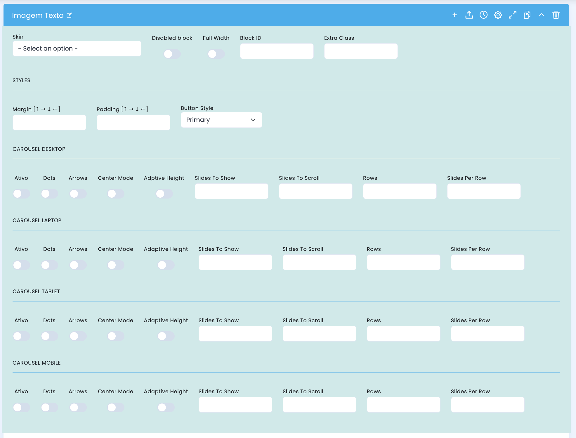
Painel de configurações avançadas — inclui opções de estrutura, espaçamentos, estilo de botão global e as configurações de carousel por breakpoint.
Configuração estrutural
- Skin escolhe uma variante visual do bloco
- Disabled block desativa o bloco sem o apagar
- Full Width faz o bloco ocupar toda a largura disponível
- Block ID define um ID único para âncora ou navegação interna
- Extra Class acrescenta uma classe específica para ajustes adicionais
Espaçamentos e botão
- Margin controla o espaço exterior do bloco nos quatro lados
- Padding controla o espaço interior do bloco nos quatro lados
- Button Style define o estilo global do botão de ação para este bloco (padrão: Primary)
Carousel — Desktop / Laptop / Tablet / Mobile
- Ativo ativa o modo carousel para o breakpoint
- Dots mostra indicadores de posição
- Arrows mostra setas de navegação
- Center Mode centra o slide ativo com visibilidade parcial dos adjacentes
- Adaptive Height ajusta a altura ao slide ativo
- Slides To Show, Slides To Scroll, Rows e Slides Per Row definem a grelha de items visíveis
Configuração do conteúdo principal
Título, texto, imagem, cores e botão de ação
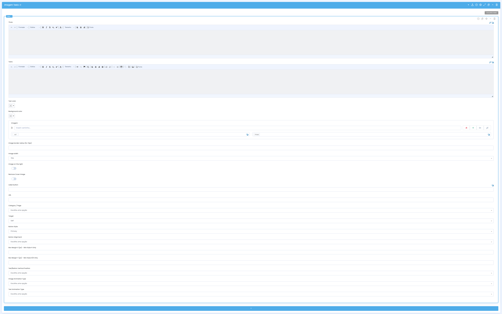
Na configuração principal defines o conteúdo editorial, a imagem e o botão de ação que compõem a secção.
Conteúdo editorial
- Título recebe o cabeçalho da secção em rich text
- Texto recebe o corpo editorial com suporte a formatação avançada
- Text color define a cor do texto para controlo sobre fundos escuros ou coloridos
- Background color define a cor de fundo da secção do bloco
Imagem
- Imagem recebe o asset visual da coluna e o campo ALT associado
- Image border radius define o arredondamento dos cantos da imagem (ex: 10px)
- Image width controla a largura relativa da coluna de imagem (padrão: 75%)
- Image on the right inverte a posição da imagem para a coluna direita
- Remove Cover Image remove o comportamento de cover na imagem
Botão de ação
- Label button define o texto do botão
- URL define o destino do botão como endereço externo
- Category/Page permite selecionar um destino interno do CMS
- Target controla a forma de abertura: Self ou New Page (padrão: Self)
- Button Style define o estilo visual do botão para este bloco
- Button Alignment alinha o botão em relação ao bloco de texto
Opções por skin
- Box Margin 4 [px] controla o espaçamento do box — apenas no Skin Style 4
- Box Margin Y [px] controla o espaçamento vertical do box — apenas nos Skin Style 4 e 5
- Estes campos ficam visíveis apenas quando o Skin correspondente está selecionado
Configurações de apresentação e interação
Posição vertical, animações de entrada
Depois de definires conteúdo e imagem, ajustas o alinhamento vertical e as animações de entrada para cada elemento do bloco.
Posição vertical
- Text/Button Vertical Position controla o alinhamento vertical do bloco de texto e botão dentro da coluna
- Útil quando a imagem é mais alta do que o texto e queres centrar ou alinhar o conteúdo editorial
Animação da imagem
- Image Animation Type define o tipo de animação de entrada aplicado à coluna de imagem
- A animação é ativada quando o bloco entra no viewport durante o scroll
- Usa animações subtis para não distrair da mensagem editorial
Animação do texto
- Text Animation Type define o tipo de animação de entrada aplicado à coluna de texto e botão
- Pode ser diferente da animação da imagem para criar um efeito de entrada sequencial
- Evita combinar animações muito distintas que criem dissonância visual
Demo e downloads
Exemplos e configurações