



Studio Help · Blocks

Testimonials Component

The Testimonials section was designed to present quotes, authors, and portraits within a repeating structure with a strong sense of social proof. It allows for control over columns by device, colors per item, image cropping, carousel behavior, and the section's visual rhythm without sacrificing credibility or editorial consistency.


General information

The Testimonials block is a modular solution for presenting multiple voices within the same visual language: image, quote, author identification, and color treatment adjusted to the page context. It works well for social proof, customer recommendations, institutional feedback, product validation, user experiences, or any section where trust needs to be built through repeated testimonials.


This block may include:


  • Image fields with ALT and TITLE in each testimonial.
  • A main quote and an author field to identify the source of the statement.
  • Control the text color , background color , and quote color for each item.
  • The "Remove round image" option allows you to remove the circular crop and create a more free-flowing portrait.
  • Defining the number of columns on Tablet , Laptop , and Desktop.
  • Independent carousel rules for Desktop , Laptop , Tablet , and Mobile , including Skin , Offset , Full Width , and animation.

Use this component when you need to reinforce credibility with multiple testimonials within the same section. Its value lies in consistent repetition, quick reading of quotes, and the ability to adapt density and navigation to each device.


Visual examples of the block

3 recurring readings of the structure

The Testimonials block can function as a static grid of social proof, as a carousel with a testimonial in greater focus, or as a set of quotes with a more editorial color treatment. The three examples below show recurring ways of applying the same component base.

Desktop · 3 columns Social proof Balanced reading
Client
Ana Martins

"The team quickly understood our context and transformed the project into a much clearer solution for the end user."

Partner
John Almeida

"The block format works very well when we want to present various opinions without losing visual order or consistency between quotes."

Institutional
Marta Soares

"The grid presentation helped us to highlight various recommendations without creating a cumbersome or overly long section."

Example 01 - Institutional testimonial grid

Suitable reading for presenting several recommendations at once, with easy comparison between authors and a sense of editorial consistency throughout the section.

Active Carousel Slides to show · 2 Dots + Arrows

Example 02 - Carousel with highlighted quote

A useful setting when you want to reduce visual density, highlight a main testimony, and still maintain easy access to the remaining testimonies in the collection.

Text color Background color Quote color
Brand
Testimony with circular image

"The combination of portrait, short quote, and author helps to make the recommendation more human and memorable."

Quote color Image round
Product
Variation with greater visual contrast

"By adjusting the background and text colors, we were able to bring the testimonial closer to the campaign's identity."

Text color Background
Event
Composition without round cutout

"The 'Remove round image' option is useful when the photograph needs to maintain a more editorial framing."

Remove round image Free portrait
Institutional
Chromatic variation for social proof

"Small color adjustments are enough to differentiate contexts without losing coherence between the various testimonies."

Theme Consistency

Example 03 - Testimonials with color styling

Suitable for sections where social proof needs to match the page's visual identity, adjusting contrast, quote color, and image placement.

When to use / When to avoid

Correct application of the component

When to use

  • To present recommendations, customer feedback, social proof, or institutional validation within a repeating structure.
  • When does it make sense to combine Image , Quote , and Author in multiple testimonials using the same visual language?
  • For sections that need to change the number of columns per device and, at some breakpoints, switch to a carousel.
  • When trust depends on the combined reading of multiple voices and not just a single isolated highlight.

When to avoid

  • When you only have one testimonial and it would work better as an integrated highlight within a larger narrative segment.
  • When quotations are too long or inconsistent, the collection loses its reading rhythm.
  • When the content relies more on complex visual storytelling than on a clear sequence of testimonials.
In this case: if you need to work with a single case with more context, a Video + Text or Image block might be more straightforward. The Testimonials block gains strength when there is real repetition between several quotes and authors.

How to set it up in practice

Recommended workflow

Collect the testimonies

  • Start by choosing short, specific, and credible quotes that demonstrate real value and not just generic praise.
  • If the group has very different voices, it is worth organizing the testimonies by context before constructing the section.

Prepare image and author

  • Organizes Image , ALT , TITLE , and Author consistently across multiple testimonials.
  • Confirm whether the photograph should appear with a circular crop or if the "Remove round image" option makes more sense for the framing used.

Define the presentation

  • Adjusts the number of columns per device and decides where the grid should remain static or switch to a carousel.
  • Fine-tune the text color , background color , and quote color to ensure contrast, focus, and consistency with the page.

Validate in context

  • Test the section on Desktop, Laptop, Tablet, and Mobile to see if the density remains comfortable and legible.
  • If a carousel is active, confirm whether the navigation and scrolling speed actually aid in reading the quotes.

Good content practices

Credibility, clarity, and readability.

Quote and author

  • The quotation should be clear, concise, and easy to read in a few seconds; the block does not benefit from overly long statements.
  • The Author field should identify the source of the testimony sufficiently to convey confidence and context.
  • If you need to add a job title, brand, or relationship to the project, make sure that this information does not compete with the main quote.

Image, color and coherence

  • The image should reinforce the authenticity of the testimony and maintain similar quality across all testimonies.
  • The background, text, and quotation colors should maintain sufficient contrast to ensure comfortable reading at any breakpoint.
  • If the section brings together very different voices, visual coherence should be ensured by the structure and not by excessive personalization in each item.
Best practice: a short, specific, and clearly attributed testimony usually has more impact than a long, generic quote. If the reading is quick and credible, the notepad is fulfilling its purpose well.

Advanced settings for the Testimonials component

Overall structure, columns, styles, and navigation.
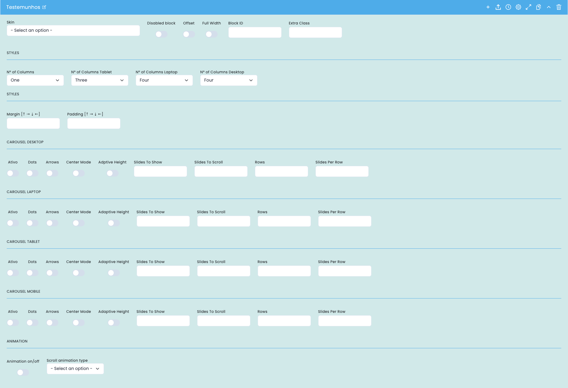
Advanced settings for the testimonials block

This screen focuses on the basic block structure, the number of columns per device, and the carousel logic at each breakpoint to control density, rhythm, and reading of the testimonies.

Block structure

  • Skin , Disabled block , Offset , Full Width , Block ID , and Extra Class define the structural framework of the section.
  • These options help to fit the component onto the page and coordinate it with specific anchors, styles, or settings.

Columns by device

  • The number of columns , number of columns for tablet , number of columns for laptop , and number of columns for desktop define the grid density in each layer.
  • The greater the number of columns, the greater the need for short quotations, clear authors, and consistent images.

General spacing

  • Margin and padding control the exterior and interior ventilation of the section.
  • These fields are important to prevent the testimonials area from becoming too compressed or disconnected from the rest of the page.

Carousel by breakpoint

  • Desktop, Laptop, Tablet, and Mobile devices can have the carousel enabled or disabled independently.
  • Dots , Arrows , Center Mode , Adaptive Height , Slides To Show , Slides To Scroll , Rows , and Slides Per Row control navigation, height, and density.

Main content configuration

Image, quote, author, and visual identity
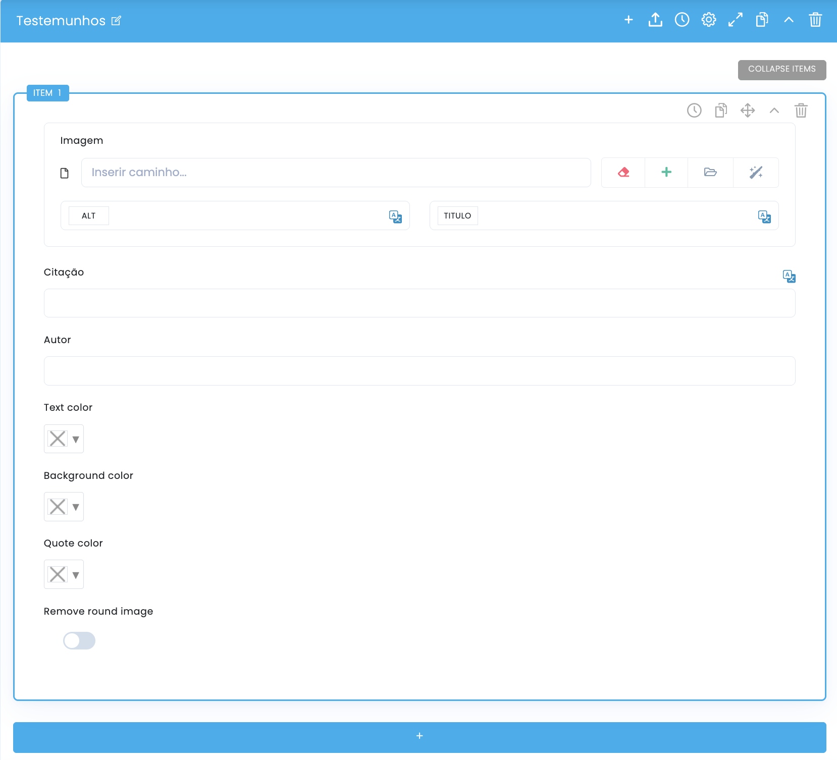
Content configuration for the testimonials block

In the main settings for each item, you can organize the portrait, the quote, the author, and the color treatment of the testimony, as well as the option to remove the circular cropping from the image.

Image of the testimony

  • Each item can receive an image with ALT text and a TITLE to reinforce authenticity and context.
  • It's important to maintain a consistent visual logic between portraits so that the section appears cohesive.

Quote

  • The Quote field contains the main message of the testimony and should prioritize clarity, specificity, and quick readability.
  • A good quote should communicate real value, not just generic praise without context.

Author

  • The Author field identifies who is speaking and helps to support the credibility of the testimony.
  • You can use this field for a proper name or for a more descriptive identifier, as long as it remains clear and legible.

Colors and cutout

  • Text color , background color , and quote color allow you to adjust the visual identity of each testimonial.
  • Removing the round image removes the circular cropping, leaving the image with a more free or editorial treatment.

Columns and carousel by device

Desktop, Laptop, Tablet and Mobile

Columns and carousel by device in the testimonials block

The same collection can behave as a static grid or as a carousel, depending on the device. This fine-tuned control is important to preserve balance, readability, and navigation rhythm at each breakpoint.

Desktop

  • It is typically the breakpoint with the greatest capacity to display more testimonies simultaneously without significantly compromising readability.
  • This is also where Rows and Slides Per Row can create denser compositions when the quote is short.

Laptop

  • It functions as an intermediate layer, useful for slightly reducing density compared to the desktop.
  • It is often worthwhile to review Slides To Show and Slides To Scroll to avoid compressed reading.

Tablet

  • On tablets, protecting the readability of the quote and the touchable navigation area is usually more important.
  • Adaptive Height can be helpful when various testimonials don't have the same volume of text.

Mobile

  • On mobile devices, it tends to make sense to reduce density and simplify the experience for a more linear and comfortable reading experience.
  • If the carousel is active, it's advisable to confirm that Dots and Arrows are still useful and not just decorative.
Best practice: treat device settings as editorial decisions, not just technical ones. What works with four testimonials on desktop may not work at all on mobile, even with the same content.

Related guides

Additional context for this block