


Hotspot Component
The Hotspot block was designed to turn an image into an interactive area with highlight points that reveal contextual content. It lets you combine a main image, multiple hotspots, text, support imagery, button and link with structural controls such as Skin, Full Width, Block ID, Extra Class, Button Style, spacing and animation.
General information
The Hotspot block is a visual solution for presenting a main image with multiple interactive points distributed across the composition. Each point can open complementary content and help the user explore details, products, specific areas of a space or contextual information without leaving the same visual area.
This block can include:
- a main image that serves as the base of the interactive experience
- multiple hotspots positioned over the image
- per-point content with Title, Text and Image including ALT and TITLE
- optional actions through Label Button and URL
- structural control with Skin, Disabled block, Full Width, Block ID and Extra Class
- Button Style, Margin, Padding and animation adjustments
Use this component when the image needs an extra layer of exploration and when it makes sense to guide attention to specific points in the composition. It is especially useful for product, decor, art, physical spaces, visual maps and contexts where detail benefits from point-by-point navigation.
Visual examples of the block
Three possible readings of the same component
The Hotspot block can take on different readings depending on the base image, how the points are distributed and the type of content associated with each interaction. The slideshow below shows three useful moments to understand the role of this component.
When to use / When to avoid
Correct use of the component
When to use
- To highlight specific details within an image without fragmenting the composition
- To explain product areas, decor pieces, artworks, plans or visual maps
- To create a guided exploration with clickable points and complementary content
- To combine a main image with extra information without forcing the user to leave the visual context
When to avoid
- When the image is too small or already visually too dense
- When there are too many points and the experience becomes confusing or hard to tap on mobile
- When the content is more linear and would be better communicated with List, Accordion or Image + Text
How to use it in practice
Recommended workflow
Prepare the base image
- Choose an image that is clear enough and has areas where the points can breathe
- Make sure the composition remains clear on both desktop and mobile
Define the hotspots
- Distribute the points in a balanced way across the image
- Avoid overlaps, overly small click areas or excessive density
Fill in the content
- Add Title, Text, a support image with ALT and TITLE and, if needed, Label Button and URL
- Keep the text short, objective and aligned with the detail the hotspot is explaining
Adjust and validate
- Define Skin, Full Width, Block ID, Extra Class and Button Style
- Test the interaction in preview to confirm positioning, readability and click behavior
Content best practices
Clarity, hierarchy and usability
Positioning and density
- Distribute hotspots in a balanced way so everything does not concentrate in the same area of the image
- Avoid placing points in overly detailed areas or too close to the edges
- If there are too many details to explain, it may be better to split the information across more than one image
Content clarity
- Use short titles and objective text so each point quickly answers the expectation it creates
- If there is a button, the label should clearly explain the action and the URL should match the hotspot context
- Always test readability on mobile, especially when the internal content includes an extra image or CTA
Advanced settings of the Hotspot component
Structure, button, spacing and animation
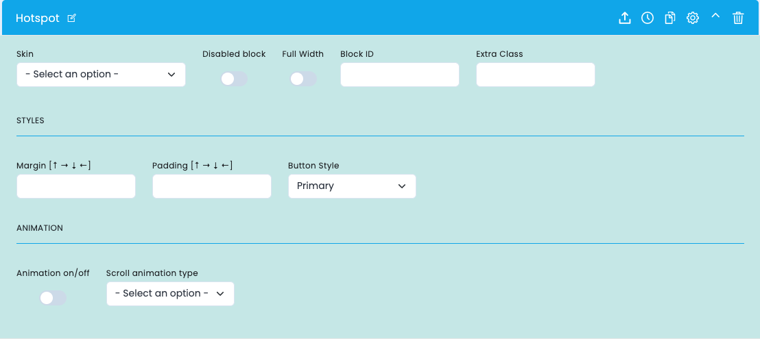
These options control how the hotspot enters the layout: visual variant, width, structural identification, button style, spacing and animation.
Block structure
- Skin defines the base visual variant of the component
- Disabled block lets you disable the block without removing it
- Full Width gives the image greater presence within the composition
Identification and button
- Block ID helps with anchors, internal navigation and technical reference
- Extra Class lets you add an extra class for specific adjustments
- Button Style defines the visual language of the CTA linked to the hotspots
Spacing and animation
- Margin and Padding fine-tune the block's relationship with the rest of the layout
- Animation on/off enables or disables the animated entrance of the block
- Scroll animation type defines the motion language applied on the frontend
- Use animation only when it reinforces visual discovery and does not make the image harder to read
Main content configuration
Base image, hotspots and content for each point
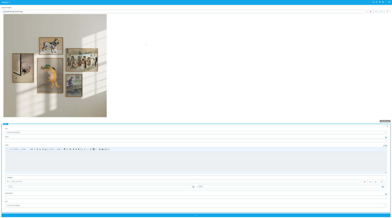
In the main configuration of the block, you define the base hotspot image and the individual content of each interactive point.
Main image
- The Hotspot Images field receives the main image where the points will be positioned
- It is important that the image is easy to read and has enough space to accommodate the interactive points
- It is worth validating in preview whether the framing remains effective across different screens
Content of each hotspot
- Each item can include an initial selector, Title, Text and a complementary Image with ALT and TITLE
- This content should clarify the detail the point is highlighting, without repeating too much information
- If the support image does not add real context, it may be better to simplify the item
Action and navigation
- The Label Button and URL fields let you connect each hotspot to a complementary action
- The button should only exist when there is a clear destination aligned with the expectation created by the point
- Always test the click, label and visual hierarchy of the content before publishing
Related guides
Complementary documentation for visual navigation