
Text Block
The Text block allows you to create editorial and informational content, such as introductions, descriptions, instructions, lists, notes, and supporting text.
General informations
The Text block allows you to create editorial and informational content, such as introductions, descriptions, instructions, lists, notes, and supporting text. It serves as a basis for explaining to the user what they are viewing and providing context to visual sections, such as Image, Tile, and Tabs.
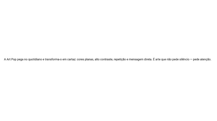
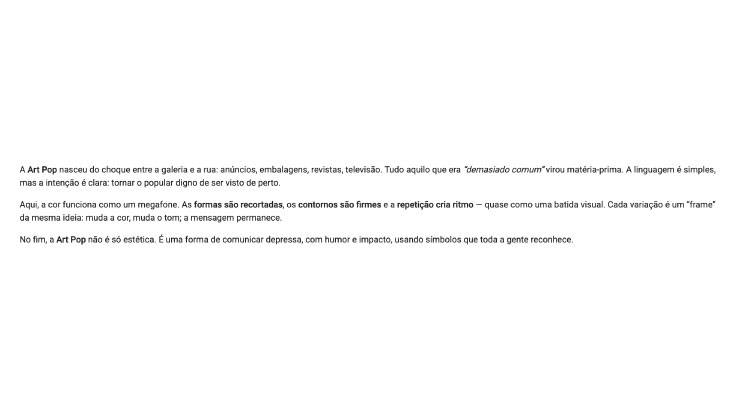
Visual examples of the block
Layout and composition variations
The Text Block can be used in different editorial contexts while keeping the same core function: presenting content in a clear, readable and structured way. The examples below help illustrate how this component adapts to short introductions, more editorial text and list-based compositions with denser information.

How to use it in practice
When to use and good practices
When to use
- To introduce a section, usually right after a Title.
- To explain benefits, details, instructions and context.
- To organise information into short paragraphs and/or lists.
Good practices
- Use short paragraphs, with 2 to 4 lines per paragraph.
- It is recommended to have between 50 and 120 words per block.
- If the text is too long, divide into paragraphs, use lists with 3 to 5 items and consider using columns.
Text editor settings
Consistency rules
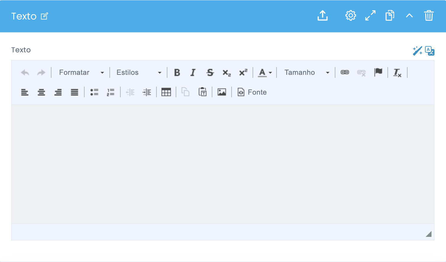
Reference image of the text editor used in the component.
What to use
- Styles: maintain consistency by using options such as “Normal” and “Heading”.
- Bold: highlight only 1 or 2 keywords.
- Lists: use bullet points or numbered lists to facilitate quick reading.
- Links: use the link option for inline URLs and CTAs.
What to avoid
- Avoid mixing sizes, fonts and colors in the same block.
- Avoid pasting text from Word or Docs without removing formatting.
- Do not use the Text block to simulate layouts; use blocks designed for that purpose.
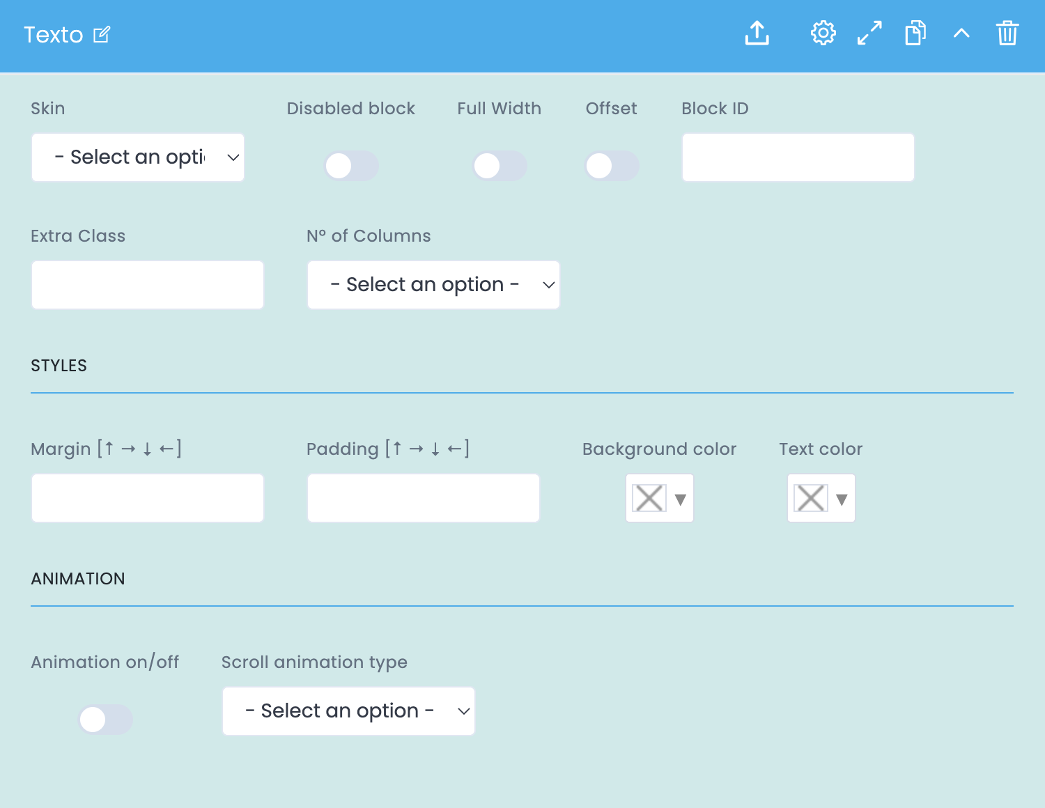
Advanced Text component settings
Image + settings summary
These options control the width, columns, colors, spacing and animation.
General block settings
- Skin applies a visual variant of the text when available in the theme.
- Disabled block disables the block without deleting it.
- Full Width makes the block occupy the full available width.
- Offset applies an offset in the grid to create an editorial effect.
- Block ID creates anchors and internal navigation.
- Extra Class allows specific adjustments defined by the team.
- No. of Columns divides the text into columns.
Styles Button
- Margin controls the outer space and separation between sections.
- Padding controls the inner spacing of the block.
- Background color helps visually separate notes, manifestos or highlights.
- Text color defines text colour and should always be checked for contrast.
Animation
- Animation on/off enables or disables animation.
- Scroll animation type defines the animation type according to the theme.
- It is recommended to use simple and discreet animations, especially on pages with a lot of content.
Block settings in Studio Demo
Examples and downloads