
Slideshow Component
The Slideshow is a block for presenting content in sequence using slides. It can be used to create a strong visual opening, highlight key messages, showcase campaigns, display collections, or build a narrative across multiple moments.
General information
The Slideshow is a block for presenting content in sequence using slides. It can be used to create a strong visual opening, highlight key messages, showcase campaigns, display collections, or build a narrative across multiple moments.
Each slideshow can include:
- text per slide
- image/video per slide
- links and buttons
- navigation using arrow keys and dots
- different visual and height characteristics
Use this component when you want to create a visual impact and a dynamic flow without requiring users to scroll through long sections.
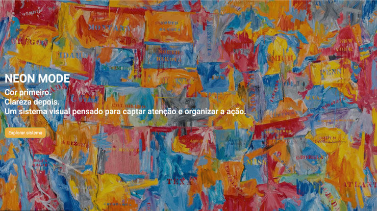
Visual examples of the block
Variations in layout and composition
The Slideshow block can take different visual approaches, while always following the same logic: presenting content in sequence, with strong visual elements and navigation between slides. The examples below help illustrate how this component can function as a main hero, a campaign block, or a storytelling sequence.
When to use / When to avoid
Proper application of the component
When to use
- To create a hero section with rotating content
- To showcase campaigns, highlights, or collections
- To display multiple messages with equal visual weight
- To build a storytelling sequence with images and text
When to avoid
- When you only have one piece of content to share
- When each slide has too much text
- When the information is too important to skim
How to use it in practice
Recommended work structure
Create the slideshow structure
- How many slides will you have
- What is the main message of each slide
- Whether each slide will include an image, text, a button, or a combination of these elements
Fill in the main content
- Button for the next section
- Associated alt text and title
- Item structure
- Next, for each item, you define the specific content of each slide
Adjust the layout
- Slideshow height
- Fade or transition
- Arrows and dots
- Spacing
- Mobile behavior
Validate in preview
- Text legibility over images
- Image cropping on desktop and mobile
- Consistency across the various slides
- Navigation time and fluidity
Best practices for content
Consistency and readability
Message and density
- Each slide should convey one main idea
- Short titles work better than long ones
- Avoid too much text on each slide
- Don’t use all the fields just because they’re there
- If a slide works with just an image and a title, don’t force additional text onto it
Consistency across slides
- Same tone
- Same visual logic
- Same content density
- Same visual quality
- If you use CTAs, try to keep them consistent throughout the slideshow
Advanced settings for the Slideshow component
Image + summary of options
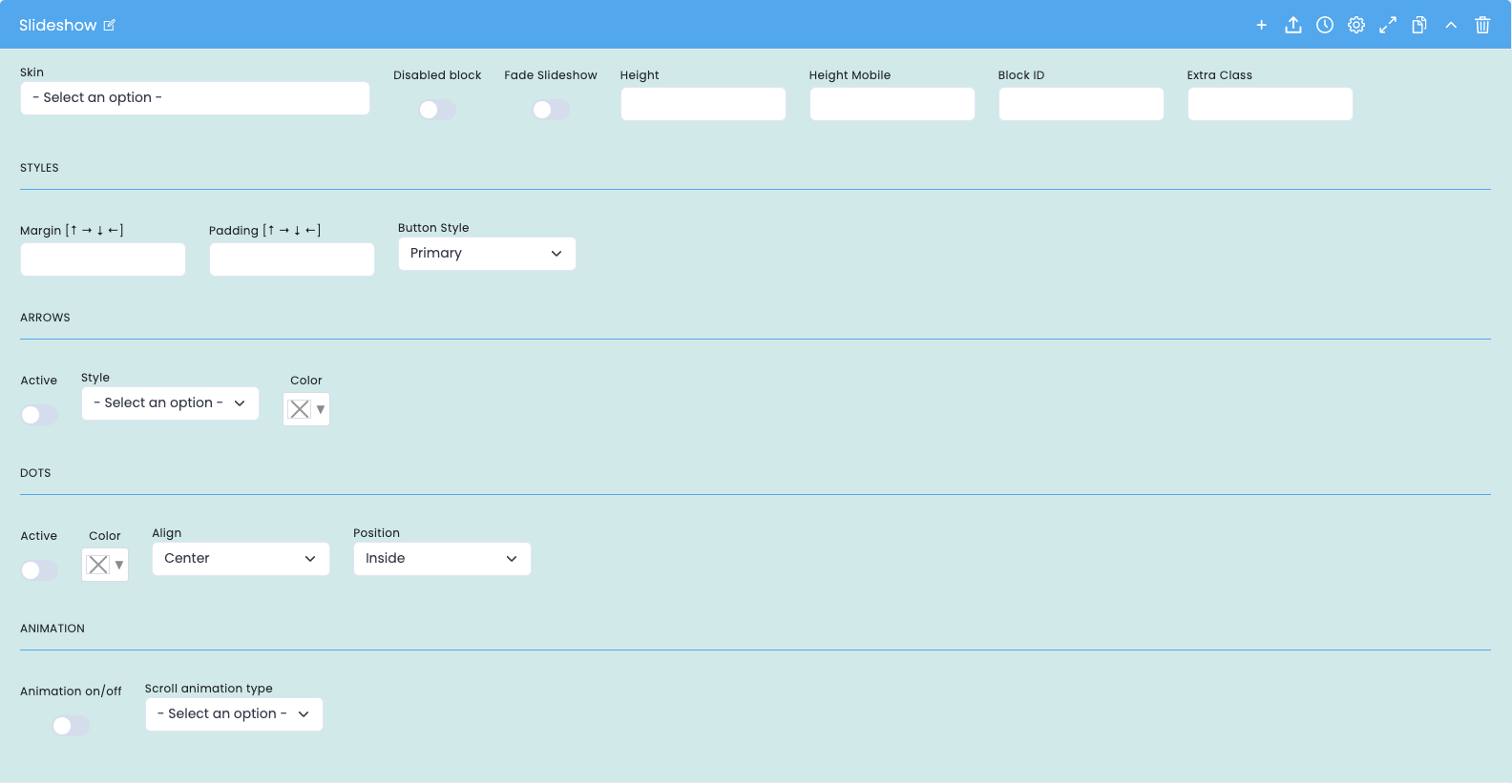
These options control the overall behavior of the slideshow, its appearance, and navigation.
General block settings
- Skin: Choose a visual style for the slideshow
- Disabled block disables the block without deleting it
- Fade Slideshow enables the fade transition effect between slides
- Height sets the height of the slideshow on desktop
- Height Mobile sets the height of the slideshow on mobile
- Block ID Unique block ID for anchors and internal navigation
- Extra Class Extra class for specific adjustments
Styles + Arrows
- Margin space outside the block
- Padding space inside the block
- Button Style defines the style of the buttons
- Arrows Active enables or disables the arrows
- Arrows Style defines the visual style of the arrows
- Arrows Color defines the color of the arrows
Dots + Animation
- Dots Active enables or disables the navigation dots
- Dots Color sets the color of the dots
- Dots Align sets the alignment of the dots
- Dots Position sets the position of the dots
- Animation on/off turns the block's animation on or off when it enters the viewport
- Scroll animation type sets the type of animation applied
General Slideshow Settings
Main structure before the items
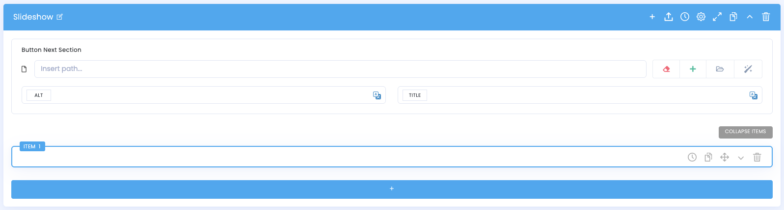
Na configuração principal do slideshow, há campos gerais que ajudam a estruturar o bloco.
General fields
- Button Next Section allows you to set up a navigation button for the next section
- ALT alternative text for image/associated element
- TITLE title associated with the resource, if applicable
Items
- Each slideshow consists of several items, with each item being an individual slide
- You can add new items, duplicate, reorder, delete, and expand/collapse
- It is recommended that you first arrange the order of the slides and then refine the content of each one
Settings for items within the slideshow
Content and layout of each slide
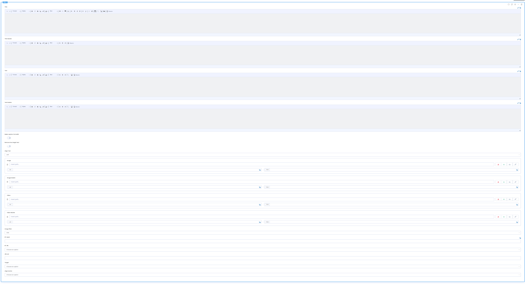
Each item represents a slide in the slideshow and can have different content for desktop and mobile.
Text fields on the slide
- Title main slide title
- Title Mobile mobile-specific version of the title
- Text supplementary text for the slide
- Text Mobile mobile-optimized version of the text
Visual content of the slide
- Make Caption full width. display the text content in full width
- Remove line height left adjusts line spacing/line height
- Align Text sets the text alignment
Slide images
- Image main slide image
- Image Mobile mobile-optimized version of the image
- Video main slide video
- Video Mobile mobile-optimized version of the video
- Image Filter controls the filter applied to the image/video
Links and buttons
- BT Label slide button/link text
- BT URL Button destination URL
- Link url additional link on the slide
- Target defines how the link opens
- Align button sets the button's alignment on the slide
Demo and downloads
Examples and settings