
Component 2-column tabs
A two-column content block: on the left, a list of tabs; on the right, the content of the selected tab.
General information
The 2 Columns Tabs is a two-column content block: the left column displays a list of tabs (options/topics), and the right column shows the content of the selected tab. The idea is to allow users to switch topics without leaving the page, maintaining context at all times and avoiding excessive scrolling.
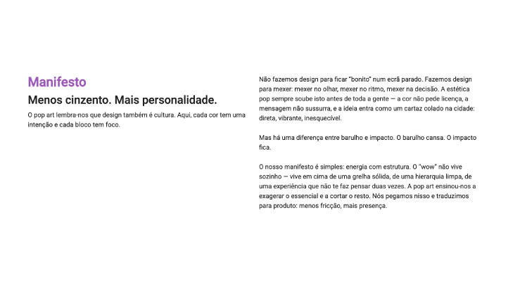
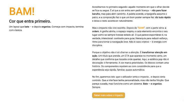
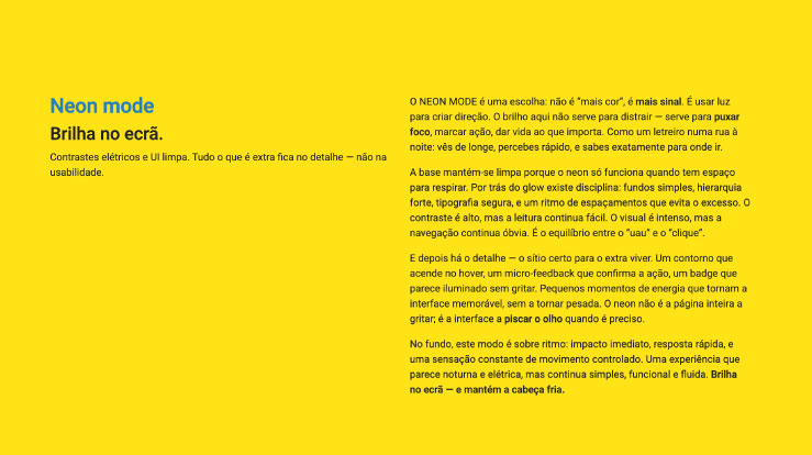
Visual examples of the block
Variations in layout and composition
The 2 Columns Tabs block can take on different visual layouts while always maintaining the same functional logic: a navigation column with tabs and a column of dynamic content. The examples below illustrate how this component adapts to different editorial and visual contexts, ranging from more informative approaches to layouts with a stronger visual focus.
How to use it in practice
Component structure
Create the tabs
- Each tab should have a short title (1–4 words).
- It can include an icon or small label, such as “New,” “Pro,” or “3 steps.”
- Think of the left column as a table of contents.
Fill in the content
- Each tab opens a panel with a title, text, and, if necessary, bullet points, an image, an example, or a CTA.
- Each panel should make sense on its own, even if the user only reads that tab.
Content best practices
How to keep the component clear
Organization
- Consistent names: the same tone and format across all tabs.
- Balanced length: panels with similar lengths avoid excessive jumps.
- One topic per tab: if there are two major ideas in one panel, you probably need another tab.
Quick scanning
- Bullets help: 3–5 bullets work very well.
- CTAs per tab: they can exist, but avoid completely different actions without a clear reason.
Advanced settings
Image + summary of the options
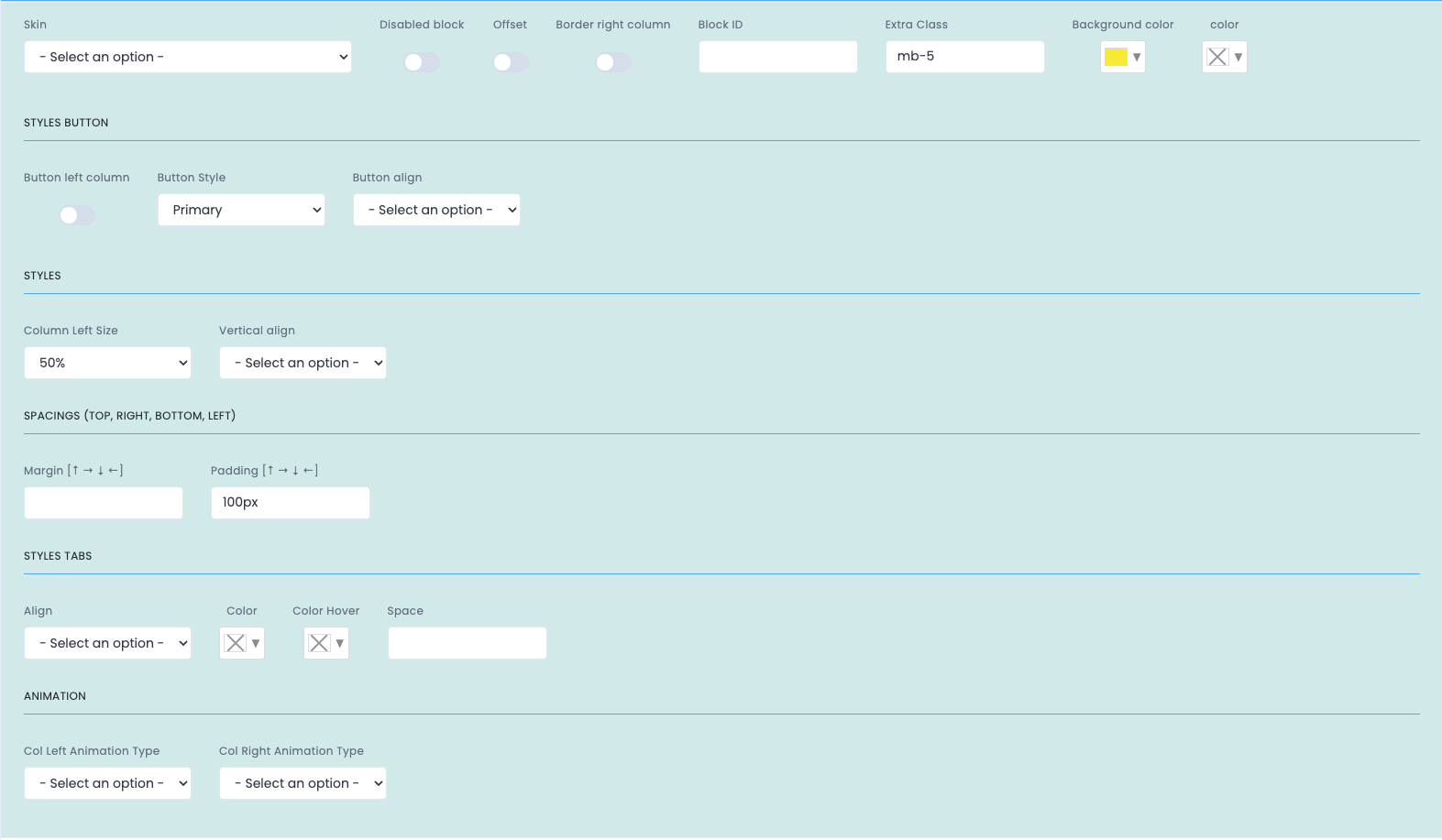
Reference image of the component's advanced settings, in higher quality than the reduced version used in the article.
General settings
- Skin applies a visual variant of the block.
- Disabled block disables it without deleting it.
- Offset creates an offset in the layout.
- Border right column visually separates the columns.
- Block ID and Extra Class are used for anchors and specific styles.
- Background color and Color define contrast and readability.
Styles Button + Styles
- Button left column places the CTA next to the tabs.
- Button Style and Button align define the button's style and alignment.
- Column Left Size adjusts the width of the left column.
- Vertical align aligns the content between the columns.
Spacings + Tabs + Animation
- Margin and Padding control the block's spacing.
- Align, Color, Color Hover and Space adjust the tabs' visual behavior.
- Col Left Animation Type and Col Right Animation Type control the animations of each column.
Demo and downloads
Examples and settings