
Component Video Text
The Video Text block was designed to bring video, title, text, and CTA together in a single module, with layout control and responsive behaviour. It allows you to combine rich text, colors, uploaded video or external IDs, cover image, autoplay, video position, button link, and carousel rules per device within the same structure.
General information
The Video Text block is a modular storytelling solution for pages where video and copy need to work together. Instead of presenting only a player, this component structures a complete message: title, supporting text, button, destination, and video presentation settings inside the same block.
This block can include:
- Title and Text fields with content editors
- Text color and Background color to control the module's readability
- uploaded Video with ALT, TITLE, and Video Width
- Youtube ID, Vimeo ID, Autoplay, and Video Cover 1920x1080
- control of Video on the right, Label button, URL, Category / Page, and Target
- Button Style and independent carousel settings for Desktop, Laptop, Tablet, and Mobile
Use this component when the video should not appear on its own and needs to be framed by copy, commercial messaging, or editorial context. It makes more sense for campaigns, launches, testimonials, interviews with summaries, product highlights, and carousel modules where each slide needs to combine media and message.
Visual examples of the block
3 recurring visual patterns
The Video Text block can work as an editorial module, an inverted feature layout, or a carousel of multiple videos with associated messaging. The three examples below summarise recurring ways to combine video, copy, and CTA without leaving the component's core logic.
When to use / When to avoid
Correct use of the component
When to use
- For campaigns, launches, and editorial modules where video and text need to work as one unit
- When the video needs a title, a summary, and a CTA to gain context and intent
- For feature sections in split layouts or carousels with multiple videos and short messages
- When it makes sense to control video orientation, button style, and carousel rules by device
When to avoid
- When you only need a simple video without supporting copy, CTA, or additional editorial structure
- When the block would become overloaded with too much text, too many carousel rules, and too little visual clarity
- When the main message depends more on static copy than on moving media
How to configure it in practice
Recommended workflow
Define the narrative
- First define the role of the block: what the title promises, what the text explains, and what action the button should drive
- If the video adds nothing to this story, it is worth reconsidering whether this is the right block type
Prepare media and copy
- Upload the Video or fill in Youtube ID / Vimeo ID and prepare the Video Cover 1920x1080
- Fill in Title, Text, and the related metadata so they match the module's promise
Define layout and CTA
- Choose Text color, Background color, Video Width, and whether the video should sit in Video on the right
- Define the Label button, destination, Target, and Button Style according to the desired action
Validate by device
- Test the carousel configuration on Desktop, Laptop, Tablet, and Mobile
- Confirm the balance between slide density, text readability, and CTA clarity across all breakpoints
Content best practices
Copy hierarchy, CTA, and visual balance
Copy and hierarchy
- The Title should quickly explain why the block matters; the Text should add depth without repeating
- If a Label button is used, the button text should promise a clear action that matches the video
- Avoid blocks where the video, the text, and the CTA compete with one another instead of reinforcing each other
Video, cover, and readability
- Use Autoplay only when motion improves the experience and does not make the reading feel more aggressive
- The Video Cover 1920x1080 should work as a valid first impression even before play starts
- If the video is placed on the right, make sure the copy on the left is still strong enough to carry the module
Advanced settings for the Video Text component
Global structure, styles, and core carousel rules
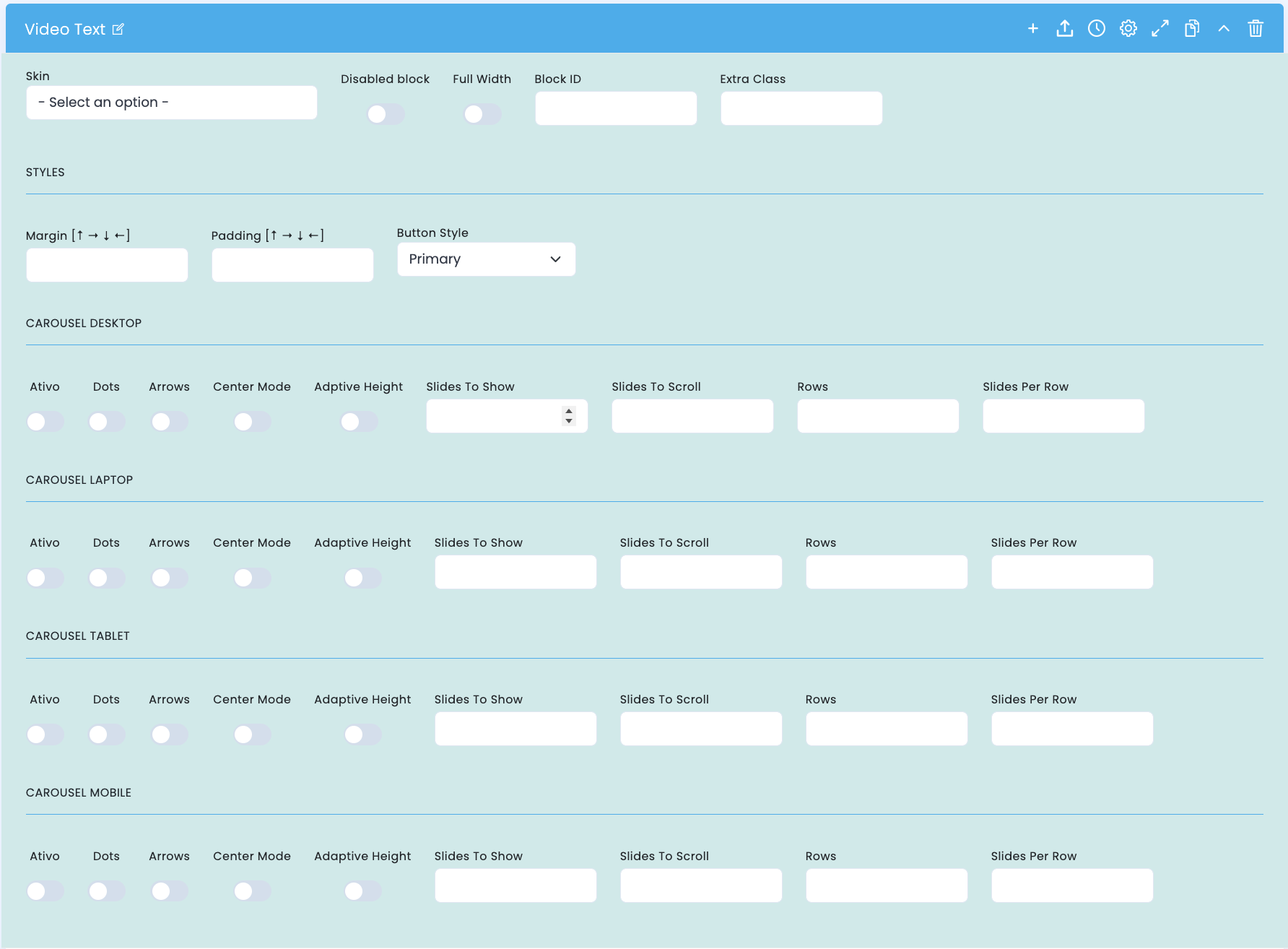
This screen brings together the base structure of the block, the button style, spacing controls, and carousel rules by breakpoint, allowing you to fine-tune how the module behaves on each device.
Base structure
- Skin defines the overall visual variant of the module
- Disabled block lets you disable the block without deleting it
- Full Width, Block ID, and Extra Class help with structural and technical placement
Styles and spacing
- Margin and Padding control how much breathing room the block has within the page
- Button Style affects the visual reading of the CTA and should match the tone of the section
- These settings help keep copy, media, and action visually consistent
Carousel activation
- Each breakpoint group includes an Ativo toggle to turn carousel logic on or off for that device
- Dots, Arrows, and Center Mode adjust navigation and the way the set is read
- Adaptive Height helps when text size varies between slides
Density by device
- Slides To Show and Slides To Scroll define how many cards appear and how many move at a time
- Rows and Slides Per Row control the internal grid of the carousel
- Desktop, Laptop, Tablet, and Mobile can all have completely different settings
Main content configuration
Title, text, colours, video, and CTA
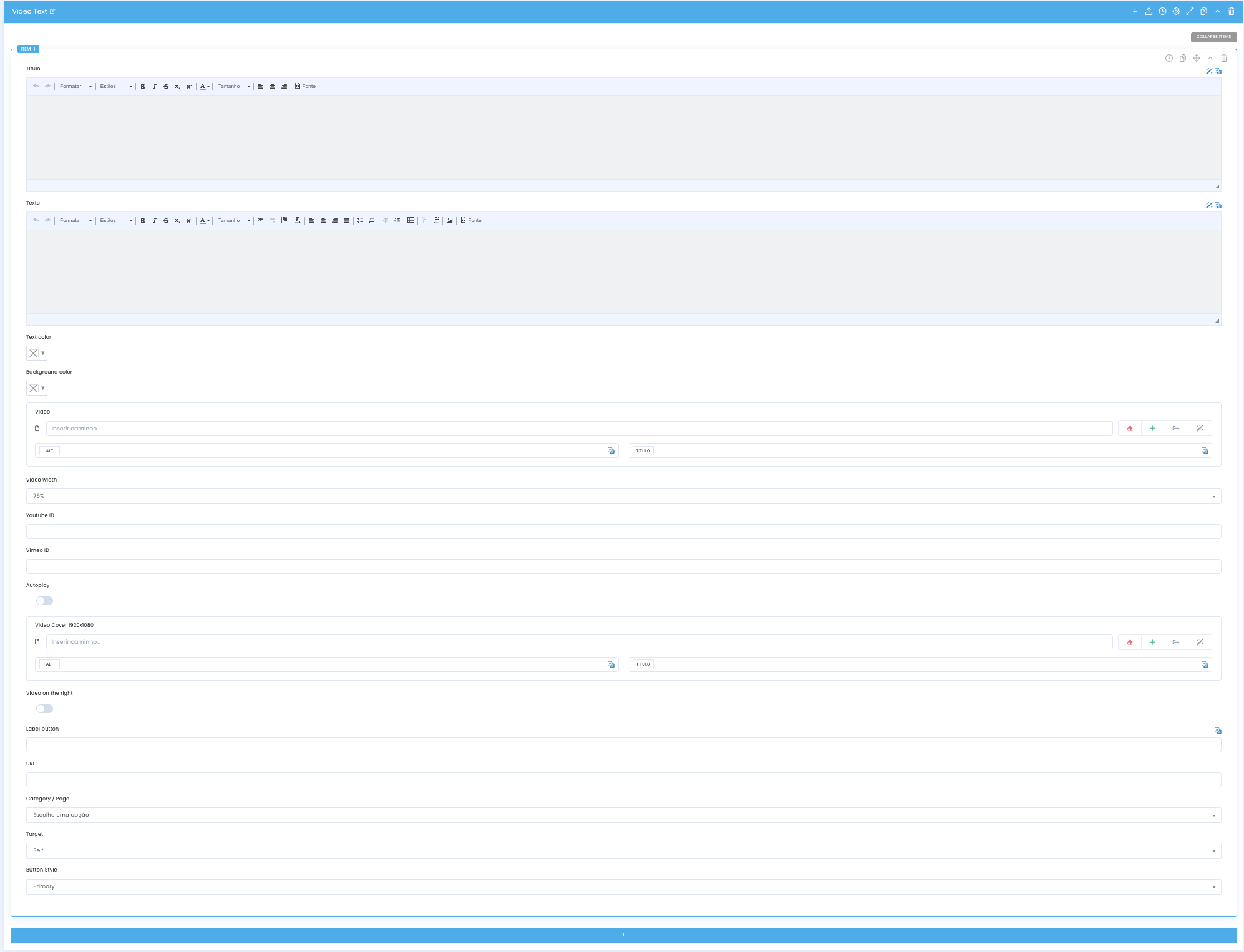
In the main block configuration, you define the copy layer, the module colours, the video source, the layout orientation, and the intended button action.
Title and Text
- The Title and Text fields act as the main editorial layer of the module
- They should be written to complement the video, not to repeat exactly what it already shows
- It is worth treating the first paragraph as a summary and the button as the closing action cue
Colours and readability
- Text color and Background color help ensure contrast and a coherent atmosphere
- These choices directly affect readability and how the CTA is perceived
- In modules with strong colour, always test whether the video and copy still breathe well together
Video and sources
- The Video field accepts an uploaded file with ALT and TITLE, while Youtube ID and Vimeo ID support external embeds
- Video Width controls the relative weight of the media area inside the module
- Autoplay and Video Cover 1920x1080 refine how the video enters the experience
CTA and destination
- Label button defines the CTA text and should clearly describe the next action
- URL, Category / Page, and Target control the click destination
- Button Style and Video on the right help close the visual reading and reinforce the layout's intent
Carousel settings by device
Desktop, Laptop, Tablet, and Mobile
The same content structure can behave differently at each breakpoint. These settings let you decide how many modules appear at once, how users navigate between them, and what density is right for each device.
Desktop
- This is usually the breakpoint with the highest visual density, where it makes the most sense to show multiple slides at once
- Rows and Slides Per Row can help build a richer grid without losing order
Laptop
- It acts as a transition between denser desktop layouts and more compact formats
- Here it is common to reduce Slides To Show or simplify navigation to preserve readability
Tablet
- It is worth protecting copy readability and avoiding too many cards per view
- Adaptive Height can be especially useful when slide text lengths are not all the same
Mobile
- In general, it makes more sense to reduce the setup to a simple reading with only a few elements visible at a time
- If Dots or Arrows are used, they should keep the experience clear rather than cramped
Related guides
Complementary context for this block