


Component Share
The Share block was designed to introduce a social sharing area within the page, accompanied by contextual editorial text. It allows you to define the visual presentation of the block, customize the appearance of the buttons, and adjust alignment, spacing, background color, and offset according to the composition.
General information
The Share block is a straightforward solution for enhancing the distribution of content, campaigns, or institutional pages through social sharing buttons presented with their own editorial framework. Instead of relying solely on loose icons, the block allows you to create a clearer sharing zone, with supporting text and visual control over the final appearance.
This block may include:
- A text field for introduction or encouragement to share.
- Structural control via Skin , Disabled block , Offset , and Block ID.
- Visual adjustments with Extra Class and Background color.
- Customizing buttons via Buttons color , Buttons color hover , Button align , Space , and Font size.
- Controlling layout fit with Margin and Padding
Use this component when sharing is a relevant action in the user journey and when it makes sense to give it its own presence in the layout. It is especially useful in articles, editorial pages, landing pages, campaigns, case studies, or content that benefits from organic reach.
Visual examples of the block
3 ways to present sharing
The Share block can take on different visual interpretations depending on the editorial context, button alignment, background color, spacing between actions, and supporting text defined in the editor. The three examples below show frequent variations without deviating from the component's basic logic.
When to use / When to avoid
Correct application of the component
When to use
- To boost the circulation of articles, news, campaigns, or institutional pages.
- When sharing requires textual context and not just loose icons.
- To create a recommendation zone at the end of the content or between sections.
- When does it make sense to align the appearance of the buttons with the visual identity of the page?
When to avoid
- When the page already has a global sharing system and it's not advisable to duplicate the action.
- When the main objective of the section is something else and sharing would distract attention.
- When the content has no real utility for recommendation, dissemination, or external circulation.
How to use it in practice
Recommended workflow
Define the message
- Write a short and clear invitation explaining why it's worth sharing the page.
- Adjust the tone to the context: editorial, institutional, promotional, or campaign-related.
Adjust the structure
- Choose the most suitable skin and set the offset only when the sharing requires greater visual autonomy.
- Use Block ID , Extra Class , and Background color according to the page composition.
Customize the buttons
- Set Buttons color and Buttons color hover with sufficient contrast.
- Adjust button alignment , spacing , and font size to ensure readability and visual rhythm.
Validate in preview
- Confirm that the text does not compete with the buttons and that the visual hierarchy remains clear.
- Check spacing, contrast, balance on mobile, and alignment with the rest of the layout.
Good content practices
Clarity, relevance, and visual coherence.
Supporting text
- Write a simple, direct message that reflects the value of the content being shared.
- Avoid generic formulas and overly vague calls to action, such as "share this" without additional context.
- If the block appears at the end of the page, use it as a natural continuation of the reading and not as an abrupt break.
Buttons and appearance
- Ensures sufficient contrast between buttons, hover, and background to maintain readability and accessibility.
- Choose the button alignment according to the composition: left for linear reading, center for more promotional areas.
- Use spacing sparingly so that the sharing appears integrated and not visually disjointed.
Advanced settings for the Share component.
Structure, buttons and composition
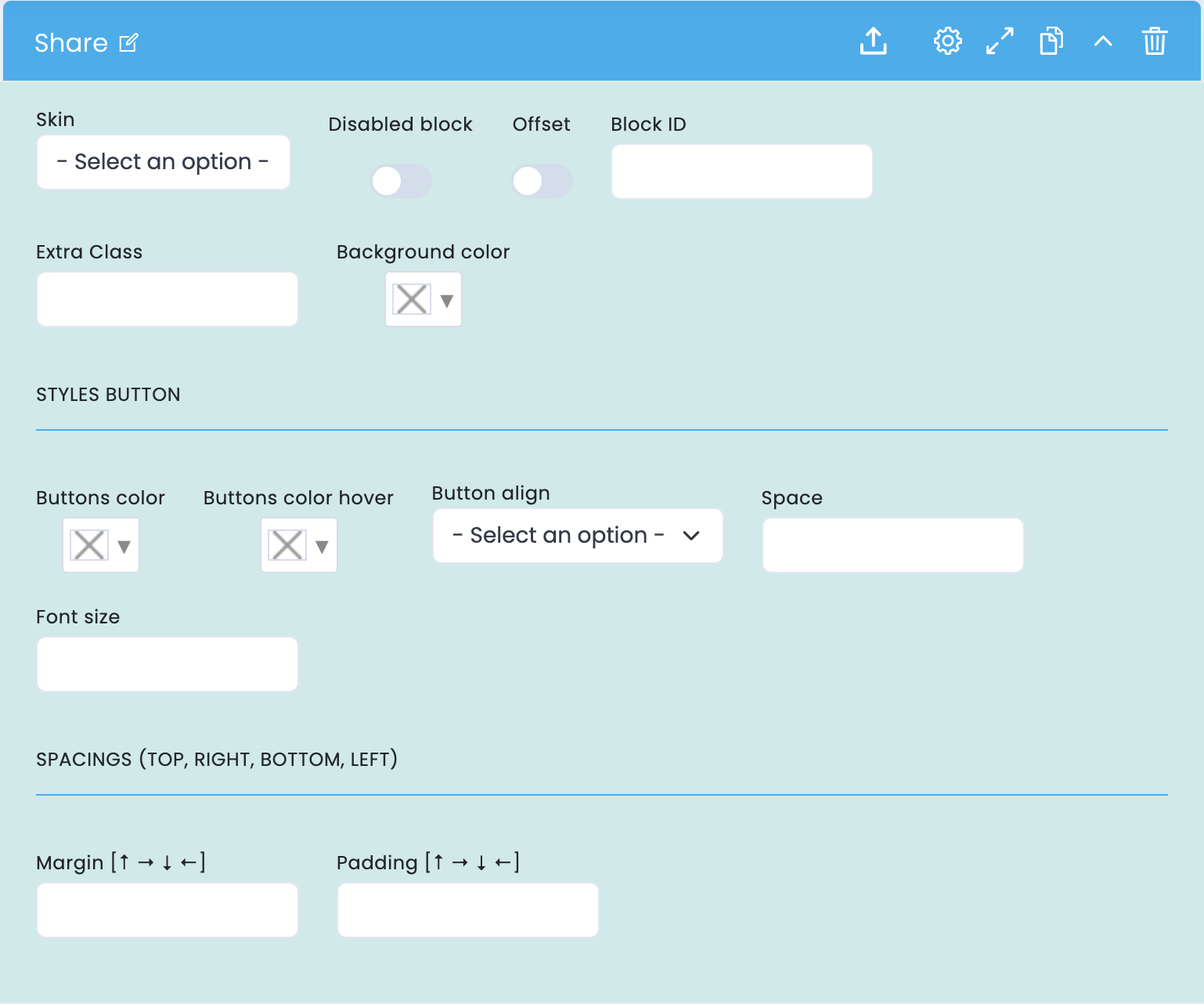
These options control the block's visual presence, its position on the page, and how the share buttons are displayed.
Basic structure
- Skin defines the base visual variant of the component.
- Disabled block allows you to disable the block without removing it.
- Block ID helps with anchors, internal navigation, and technical references.
- Extra Class allows you to add an additional class for specific adjustments.
Block composition
- Offset moves the block away from the normal flow when the share needs greater emphasis.
- Background color creates a separate area for content and buttons.
- These decisions help integrate Share into the editorial rhythm without making it visually detached.
Buttons and rhythm
- Buttons color and Buttons color hover control the normal state and hover state of the buttons.
- Button alignment , spacing , and font size adjust readability, hierarchy, and visual comfort.
- Margin and padding refine the relationship of the block to the rest of the layout.
Main content configuration
Text editor and sharing framing
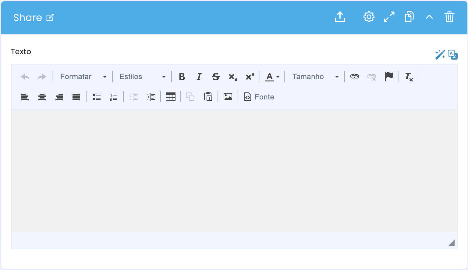
In the main block configuration, there is a Text field. This is where you define the editorial message that presents and frames the sharing action.
Text Field
- The Text field receives the introduction, invitation, or short message of support for sharing.
- You can use simple formatting to highlight a phrase, a headline, or a small editorial hierarchy.
- The shorter and clearer the message, the more natural it will be to read before taking action.
Tone and intention
- The message should explain why sharing makes sense at that point in the journey.
- The tone can be more editorial, more institutional, or more promotional, depending on the context of the page.
- In the final review, it confirms that the text and buttons form a clear and balanced unit.
Related blocks
Guides that can complement this component