
Mosaic Component
The Mosaic block was designed to build modular visual compositions where each item can combine image, text, filter, link, and different weights inside the grid. It lets you control gap, spacing, background, inside container, animation, and the horizontal and vertical footprint of each tile, while keeping ALT and TITLE tied to each item.
General information
The Mosaic block is designed to build visual areas with multiple tiles, each with its own weight, content, and destination. Instead of repeating images with uniform behaviour, this component lets you create a more editorial grid, where some pieces gain more width, others more height, and text can become part of the composition itself.
This block can include:
- multiple items with image, text, and link inside the same block
- ALT and TITLE assigned individually to each image
- per-tile control of border radius and image filter
- adjustments for Horizontal Columns and Vertical Rows
- Order Mobile settings to reorganise reading order on smaller screens
- linking through URL or Category / Page, with its corresponding Target
- structural control over gap, background, inside container, and animation
Use this component when the goal is to build a composition with hierarchy, rhythm, and multiple entry points. Mosaic makes the most sense when each tile has a clear role within the layout, not simply when you need to list images in a uniform way.
Visual examples of the block
Layout and composition variations
The Mosaic block can take very different visual forms depending on the relationship between horizontal and vertical spans, the use of text, filters, and click destinations. The three examples below summarise recurring frontend patterns without losing visual coherence.
When to use / When to avoid
Proper use of the component
When to use
- For campaigns, editorial hubs, and visual entry points to multiple pages or categories
- When each tile needs its own weight, with different spans and possible use of text
- To build modular compositions where image, copy, and link work together
- When the section hierarchy should come from the grid rather than from a uniform list of images
When to avoid
- When you only need a single isolated image without any compositional logic between tiles
- When the narrative is fully sequential and depends on slide-by-slide rotation
- When the text content is too long to fit clearly inside the grid
How to configure it in practice
Recommended workflow
Define the base
- Choose Skin, Gap, background, and the structural logic of the block
- Decide whether the mosaic should feel more contained inside the container or more open in the composition
Build the items
- Upload the image, fill in ALT and TITLE, and decide whether the tile needs text
- Use image filter and border radius only when they improve readability and visual tone
Balance the spans
- Adjust Horizontal Columns to control relative width
- Adjust Vertical Rows to control height and grid rhythm
Validate mobile and click flow
- Confirm Order Mobile, text legibility, and balance between tiles
- Review URL, Category / Page, and Target to ensure coherent frontend behaviour
Content best practices
Visual curation, order, and accessibility
Hierarchy and rhythm
- Choose 1 or 2 tiles with stronger prominence and let the others support that reading flow
- Avoid giving special weight to almost every item, because the mosaic quickly loses clarity
- Use gap, spans, and scale contrast to build rhythm, not to compensate for a lack of curation
Text, filter, and destination
- If you use the Text field, make sure there is enough contrast between copy and image
- The Image filter should reinforce readability, not hide the quality of the asset
- If a tile looks clickable, the configured destination should match that visual expectation
Advanced settings for the Mosaic component
Structure, spacing, and core behaviour
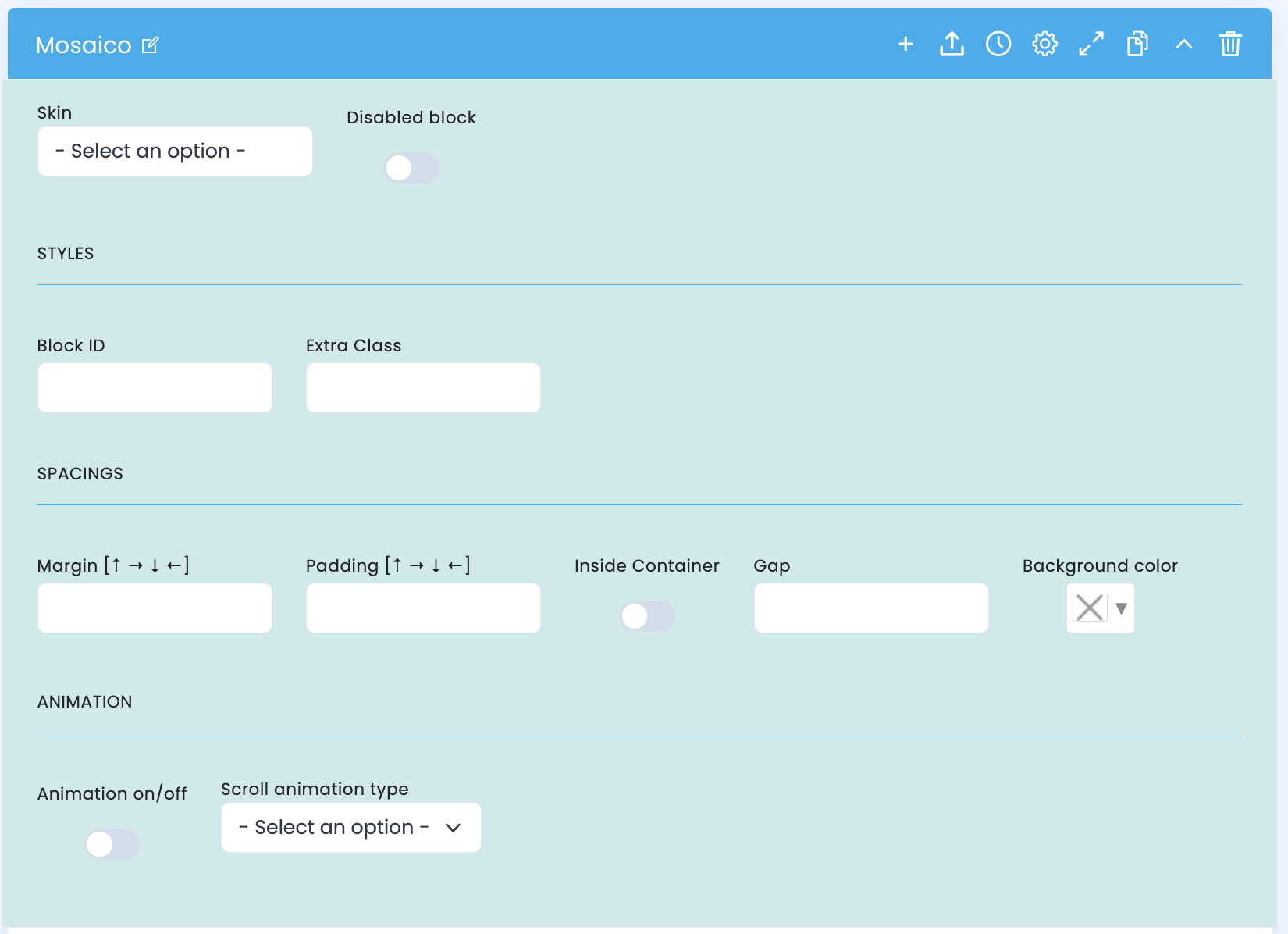
These options control the structural base of the mosaic: the visual identity of the block, its internal organisation, spacing, and how the composition fits into the page layout.
Base structure
- Skin defines the overall visual variant of the block
- Disabled block lets you disable the block without deleting it
- Block ID and Extra Class help with organisation, anchoring, and customisation
Spacing and container
- Margin and Padding define how the mosaic fits into the rest of the page
- Inside Container controls whether the grid follows the container width more closely
- Gap defines the breathing space between tiles and directly influences visual rhythm
Colour and animation
- Background color defines the structural background of the composition
- Animation on/off turns the block entrance animation on or off
- Scroll animation type adjusts the animation type applied on the frontend
Main content configuration
Image, metadata, and copy for each tile
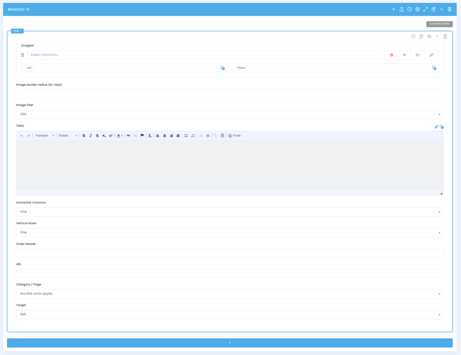
Each mosaic item receives its own asset, metadata, and content block. This is where both the visual base of the image and the text that may appear inside the tile are defined.
Media and metadata
- The Image field receives the main asset for each tile
- ALT and TITLE are assigned individually to that image
- This helps preserve accessibility and context even when the composition mixes several visual roles
Visual treatment
- Image border radius controls the visual softening of the corners
- Image filter helps darken or unify the image so it can better support text
- These options should serve readability, not hide a weak asset
Tile text
- The Text field lets you insert copy directly into the composition
- It works well for short titles, editorial callouts, or small support lines
- If the copy is too long, the tile loses impact and the mosaic becomes visually heavy
Item presentation settings
Spans, mobile order, and click behaviour
After defining the image and copy, this is where you decide how much space each tile occupies, how it reorganises on mobile, and where the user is sent when there is interaction.
Horizontal Columns
- In practice, this field defines how many horizontal columns the tile occupies inside the grid
- One tends to keep the base width; higher values make the tile gain more presence along the horizontal axis
- It works well for panoramic images, visual heroes, or tiles that need to open the reading flow
Vertical Rows
- This field controls how many vertical rows the tile occupies, changing its perceived height
- One tends to keep the base height; higher values make the tile grow along the vertical axis
- It is useful for portraits, details, or text blocks that need more breathing room
Order Mobile
- It lets you reorganise the order of the tiles when the grid collapses on mobile
- It matters when the main desktop tile should not necessarily appear first on smaller screens
- It helps protect the narrative flow and the commercial priority of the section
URL, Category / Page, and Target
- URL defines a direct destination for the tile
- Category / Page helps connect the tile to an internal page when that relationship already exists in the CMS
- Target controls whether the opening happens on the same page or in a new context
Related guides
Supporting context for this block