
Title Component
The Heading block introduces sections and establishes the visual hierarchy of the page, including main headings, section headings, and subheadings. It guides the user and organizes the layout.
General information
The Heading block introduces sections and establishes the visual hierarchy of the page, including main headings, section headings, and subheadings. It guides the user, creates visual rhythm, and helps organize the reading experience across the page.
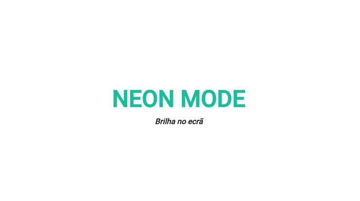
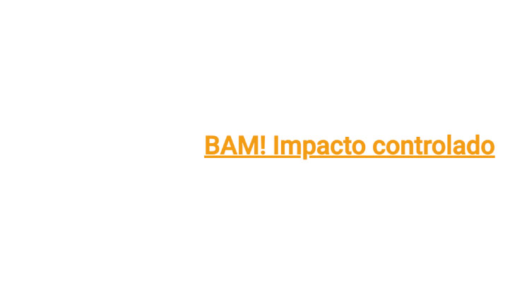
Visual examples of the block
Variations in layout and composition
The Title block can take on different visual styles, while always maintaining the same primary function: introducing sections and reinforcing the page hierarchy. The examples below help illustrate how this component adapts to more editorial, more functional, or more visually prominent contexts.

How to use it in practice
Structure and content
Type the title in the editor
- In the title field, enter your text and apply only the essential formatting.
- Include only one idea per title.
- Choose titles that are between 3 and 8 words.
- Avoid titles that take up more than two lines on mobile devices.
Define the hierarchy.
- Use the editor's Styles menu to maintain consistency between section titles and subtitles.
- Avoid manually mixing sizes or fonts.
- If you need to explain something, use a Text Block below with one or two short paragraphs.
Good content practices
How to keep the component clear
Clarity
- Short, clear titles work better than long, overly “poetic” ones.
- If the title requires a lot of punctuation to make sense, it’s probably trying to say two things at once.
- Maintain the same tone throughout the page.
Rhythm
- On long pages, use headings to create sections and avoid unnecessary scrolling.
- Use the Title block for the main message and leave the context for the Text block right below it.
Advanced settings
Image + summary of options
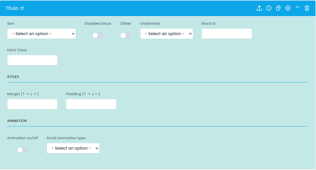
Reference image of the advanced settings for the Title component.
General settings
- Skin selects a visual variant of the title.
- Disabled block disables the block without removing it.
- Offset applies an offset to the positioning.
- Underlined enables or sets the underline style for the title.
Identification and spacing
- Block ID creates anchors and internal navigation.
- Extra Class allows for specific adjustments when the team agrees.
- Margin controls the space outside the block.
- Padding controls the interior space, which is especially useful when there is a background.
Animation and editing
- Animation on/off enables or disables the animation when entering the viewport.
- Scroll animation type defines the type of animation available in the theme.
- In the editor, prioritize the use of styles, use bold sparingly, and avoid manual line breaks.
Demo and downloads
Examples and settings