
Component Gallery
The Gallery block was designed to organize multiple images into a coherent composition, with grid reading, carousel behavior, and configurable zoom. It lets you control spacing, visible slides, dots, arrows, center mode, and the masonry structure of each item, while keeping ALT and TITLE tied to every image.
General information
The Gallery block is ideal when the goal is not to highlight just one image, but to build an organized visual set with multiple media pieces. It works well for portfolios, editorial collections, product showcases, project references, or any context where the strength lies in the relationship between images.
This block can include:
- multiple image items inside the same block
- carousel mode with control over dots, arrows, and pagination lines
- gap, slides to show, and center mode settings
- horizontal and vertical masonry options per item
- individual border radius for each image
- ALT and TITLE for each gallery item
- global control over full width, zoom, and animation
Use this component when you need to present a set of images with visual unity, without falling into the logic of a single isolated image or the more sequential narrative typical of a slideshow.
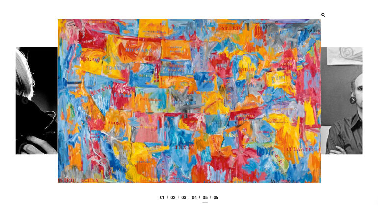
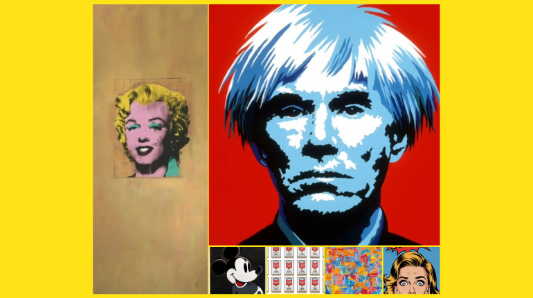
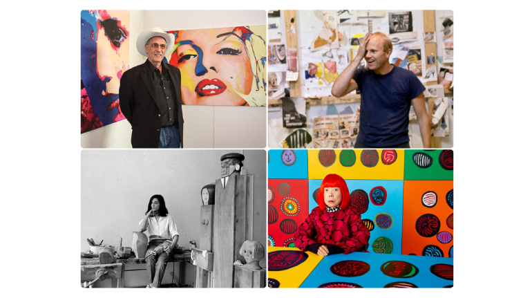
Visual examples of the block
Layout and composition variations
The Gallery block can produce very different visual results depending on the relationship between image scale, crop, spacing, navigation, and masonry balance. The slideshow below focuses on three gallery outcomes that help illustrate how this component can behave on the frontend.
When to use / When to avoid
Correct application of the component
When to use
- To present multiple images with visual unity in a single section
- For portfolios, showcases, editorial galleries, and visual references
- When you need to combine grid, carousel, and masonry rhythm
- When the reading depends on the relationship between several items rather than a single image
When to avoid
- When there is only one main image and the highlight should stand alone
- When each item needs a lot of text or complex editorial context
- When the narrative should be clearly sequential, with a slide-by-slide rotation focus
How to configure it in practice
Recommended workflow
Set the base
- Choose Skin, Gap, Full Width, and the block's overall logic
- Decide upfront whether zoom should stay enabled or not
Build the carousel
- Define Dots, Arrows, Arrow Style, and Slides To Show
- Adjust Center Mode and Pagination Lines only if they improve the reading
Build the items
- Upload each item's image and fill in ALT and TITLE
- Apply border radius and masonry structure where it makes sense
Validate the result
- Confirm rhythm, spacing, and consistency between images
- Test readability on desktop, mobile, and in carousel navigation
Content best practices
Visual curation, order, and accessibility
Visual curation
- Choose images with a clear visual relationship, even when crops differ
- Avoid mixing too many styles, proportions, or treatments in the same gallery
- Use gap, visible slides, and masonry to build rhythm, not to hide a lack of curation
Order and context
- Fill in ALT and TITLE for all items, especially when the image carries its own meaning
- Make sure the item sequence makes sense on desktop and in carousel navigation
- If the block has zoom enabled, make sure image quality supports close inspection
Advanced settings for the Gallery component
Structure, styles, carousel, and animation
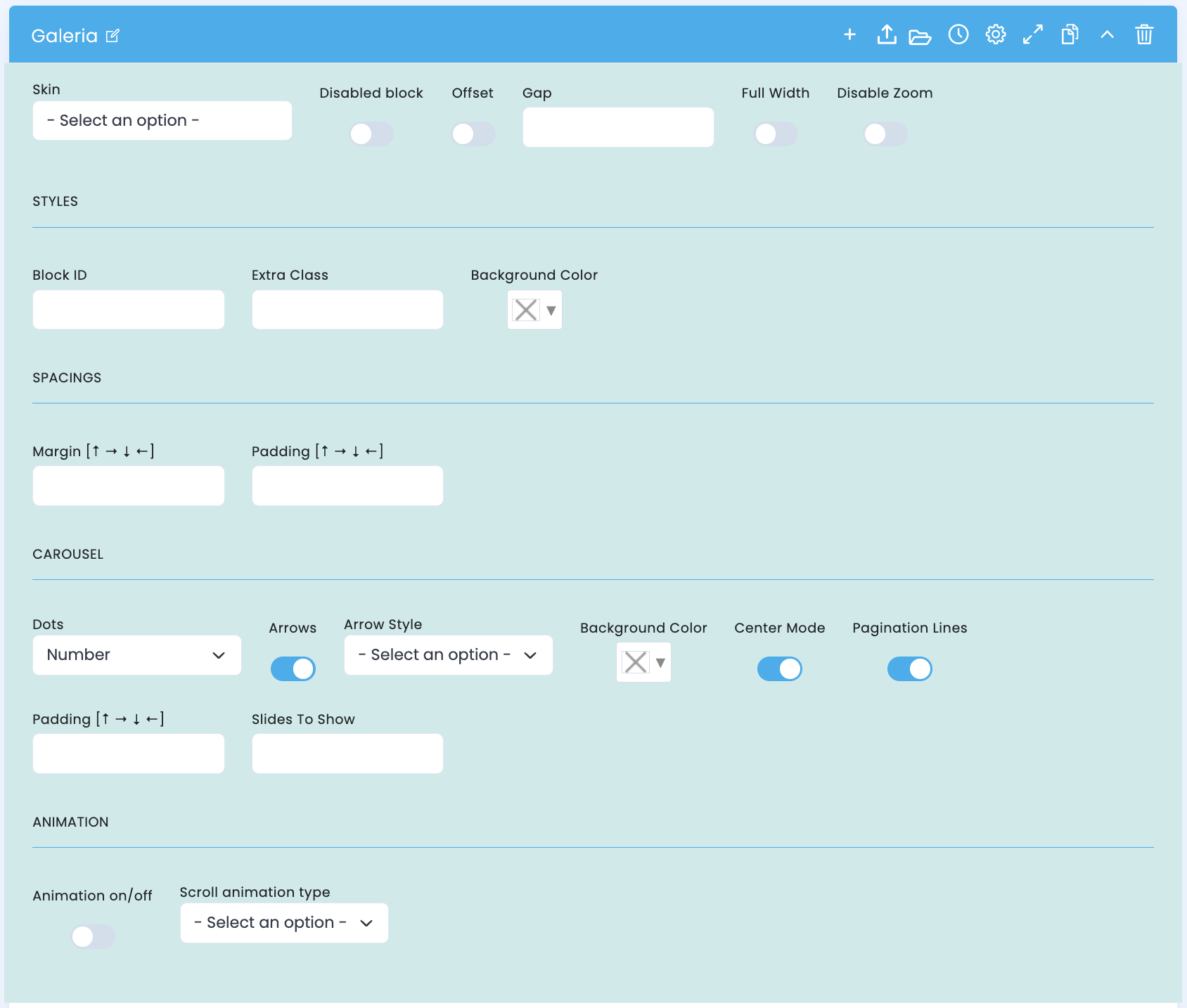
The top section of the block concentrates the gallery's base structure: overall behavior, styles, spacing, carousel control, and entry animation.
Base structure
- Skin defines the block's global visual variant
- Disabled block lets you disable the block without deleting it
- Offset and Gap help fine-tune spacing and rhythm
- Full Width makes the gallery occupy the full available width
- Disable Zoom controls zoom behavior across the whole set
Styles and spacing
- Block ID and Extra Class help with organization and customization
- Background Color defines the block's structural background
- Margin and Padding adjust how the gallery sits within the page
Carousel and animation
- Dots, Arrows, and Arrow Style build the navigation layer
- Slides To Show, Center Mode, and Pagination Lines change how the set is read
- Animation on/off and Scroll animation type control how the block enters on the frontend
Main content configuration
Image, metadata, and individual item control
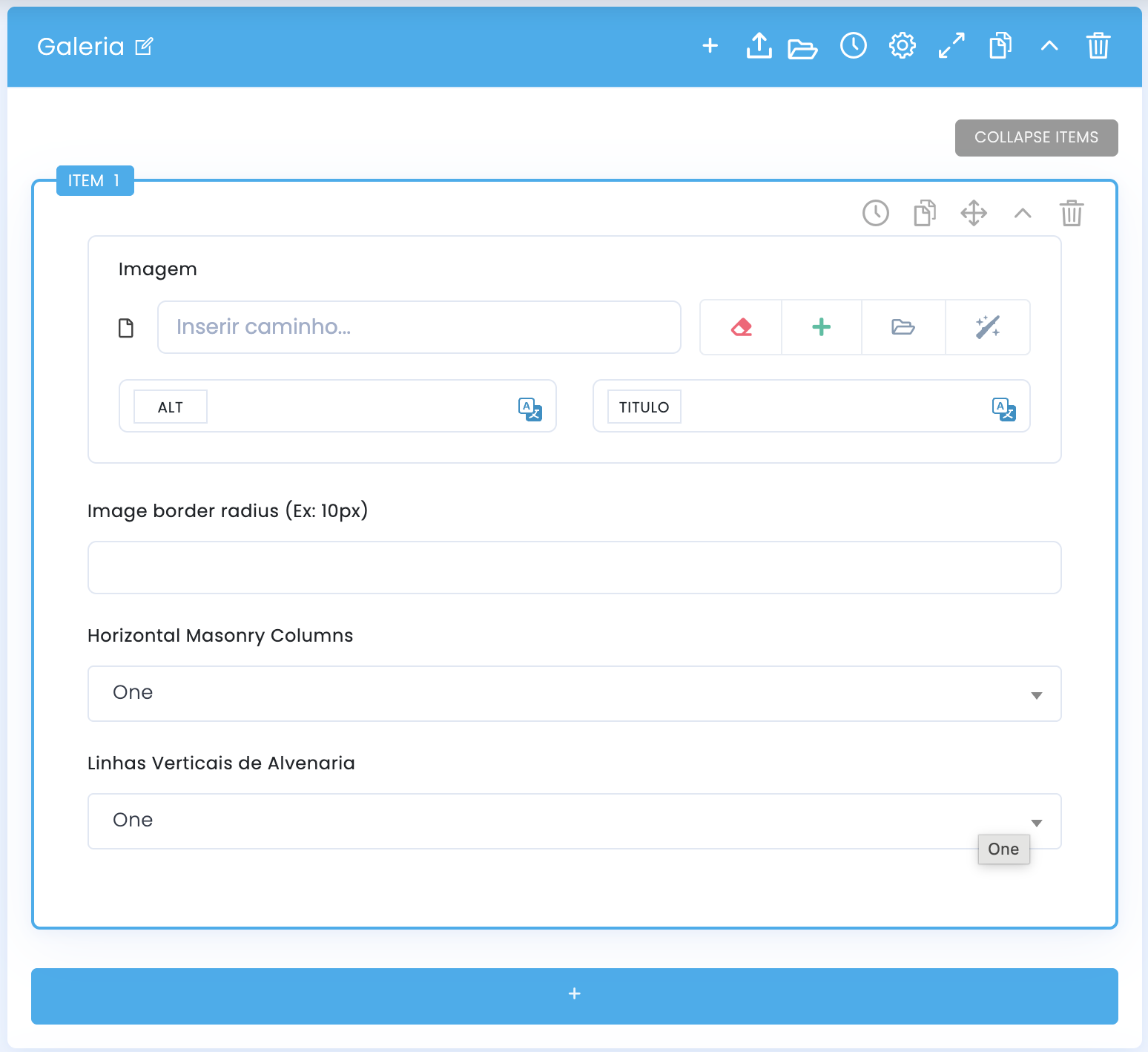
Each gallery item has its own life: it receives media, metadata, and a set of fields that directly influence its visual weight inside the composition.
Media and metadata
- The Image field receives each item's main asset
- ALT and TITLE are attached to that image individually
- This helps maintain accessibility and context even in galleries with many items
Item management
- Items are organized in a flow that lets you manage order and structure
- The side icons suggest a quick-control logic at the item level itself
- It is worth reviewing each item before validating the final result in preview
Item presentation settings
Horizontal masonry, vertical masonry, and visual hierarchy
After defining each item's image, you can adjust how that item occupies the grid. This is where the fields related to masonry and visual weight inside the composition come into play.
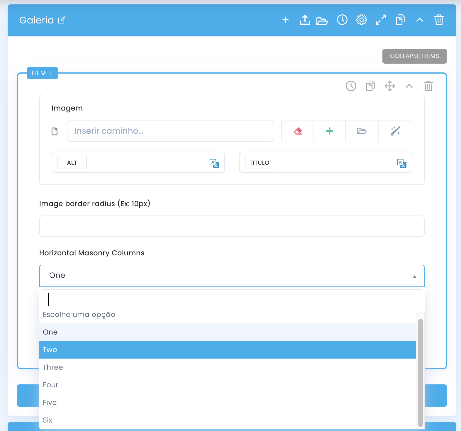
Horizontal Masonry Columns
- In practice, this field usually defines how many horizontal columns the item occupies within the grid
- One tends to keep the base width; Two, Three, and higher values make the item span more width
- It works well for panoramic images, highlights, or items that need more prominence
- If several items use very wide spans at the same time, the gallery can lose balance
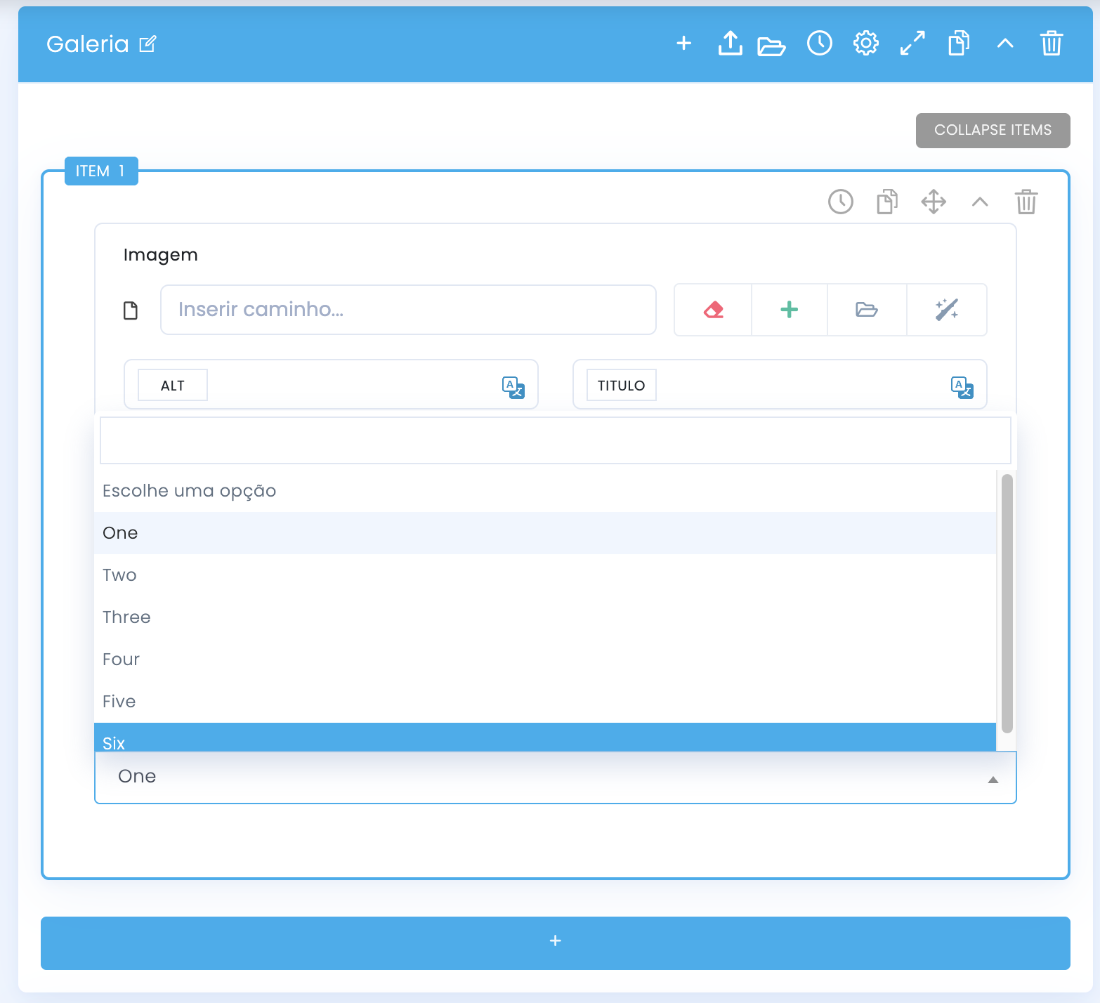
Vertical Masonry Rows
- This field usually controls how many vertical rows the item occupies, directly influencing its apparent height
- One tends to keep the base height; higher values make the item grow on the vertical axis
- It is useful for portraits, details, or images that benefit from a taller and less compressed reading
- Ideally, you should combine this field with the horizontal one intentionally, to create rhythm without disorganizing the grid
When you increase the horizontal value, the card tends to become wider inside the grid and stand out more in the overall set.
When you increase the vertical value, the card tends to become taller and create a stronger masonry reading.
Demo and downloads
Examples and settings