
How to work with blocks in StudioCMS
Blocks are reusable content pieces — text, image, slideshow, tabs and other components — that together build a page. The basic logic is simple: add a block, configure it, order it and publish it.
Enter edit mode
Slideshow · two paths
Add a new block
Creation and setup
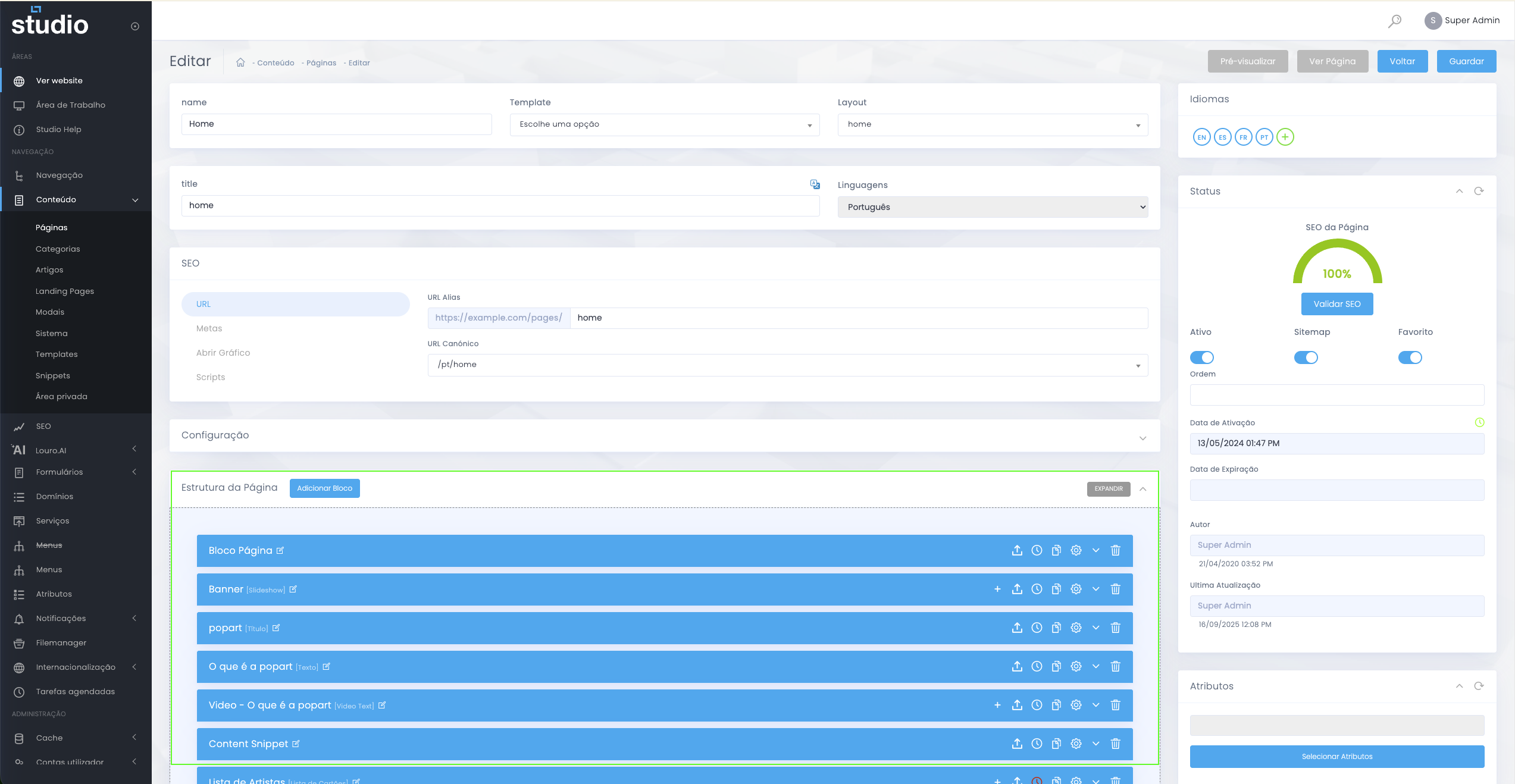
Reference image of the process of creating a new block.
- On the page, choose Add block or the equivalent creation button.
- Select the block type, for example Text, Image or Slideshow.
- Fill in the main fields: title, text, images, CTAs and any other required elements.
- Save the changes so the block is registered in the page structure.
Common advanced settings
Base settings shared by several blocks
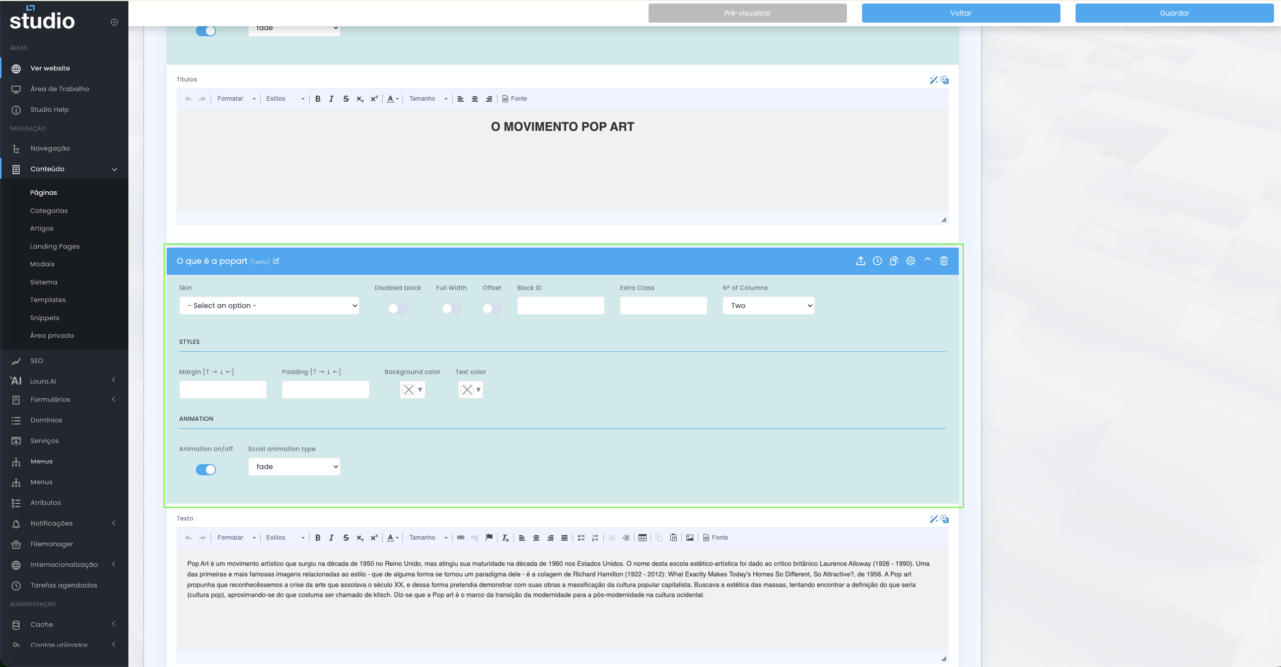
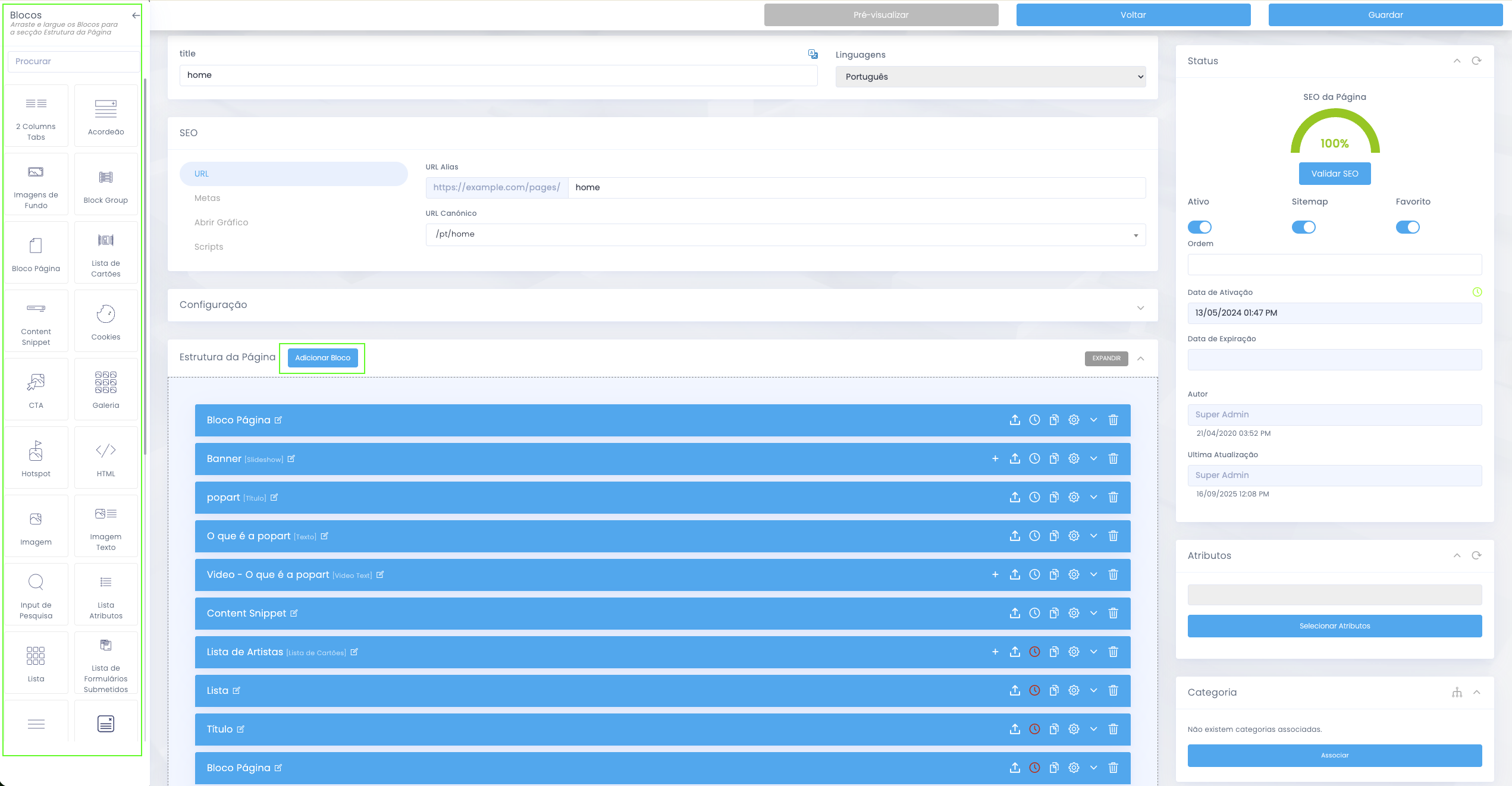
Visual example of the advanced settings available across several block types.
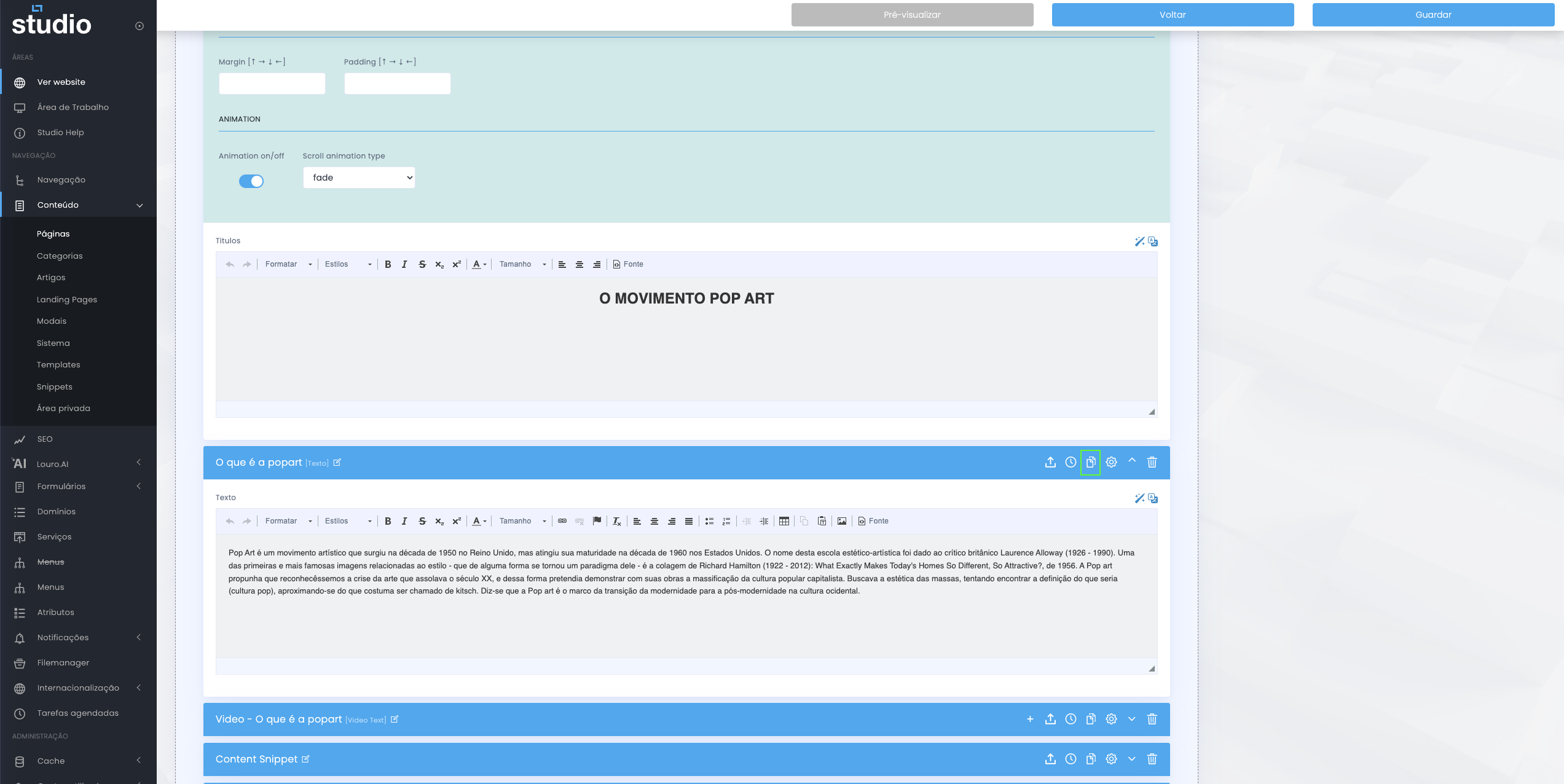
Many blocks share a set of base settings, usually inside the block settings area. The most common options include Skin, Disabled block, Full Width, Block ID / Extra Class, Margin / Padding, Background color / Text color and Animation / Scroll animation type.
Structure and layout
- Skin defines the visual variant of the block.
- Full Width allows the block to use the full available width.
- Margin and Padding control spacing.
- Background color and Text color help ensure contrast and readability.
Control and customisation
- Disabled block allows you to hide without deleting.
- Block ID and Extra Class are useful for anchors, tracking and customisations.
- Animation and Scroll animation type control additional visual behaviour.
Duplicate a block
Gain speed without losing consistency
Visual example of the duplication action for an existing block.
When you need the same layout with different content, use the Duplicate action in the block menu and then change only what is different, such as text, images and links.
It is a good practice to duplicate blocks that are already well adjusted in terms of spacing, colours and alignment, in order to maintain consistency throughout the page.
Reorder blocks
Control rhythm and narrative
- In the page block list, drag the block using the ordering handle.
- Drop the block into the correct position within the structure.
- Save the new order so it reflects the intended rhythm of the page.
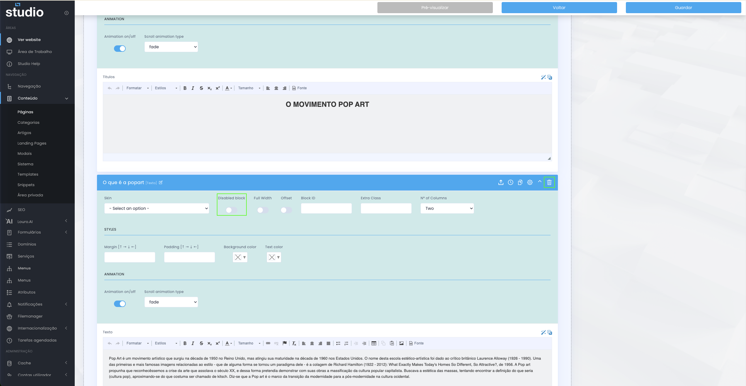
Disable vs delete
Choosing the right action
Visual comparison between disabling a block and removing it permanently.
- Disable is the ideal option for tests, seasonal content or drafts you may want to recover later.
- Delete should only be used when you are sure you will no longer need the block.
Publish and validate on the site
Confirm the final result
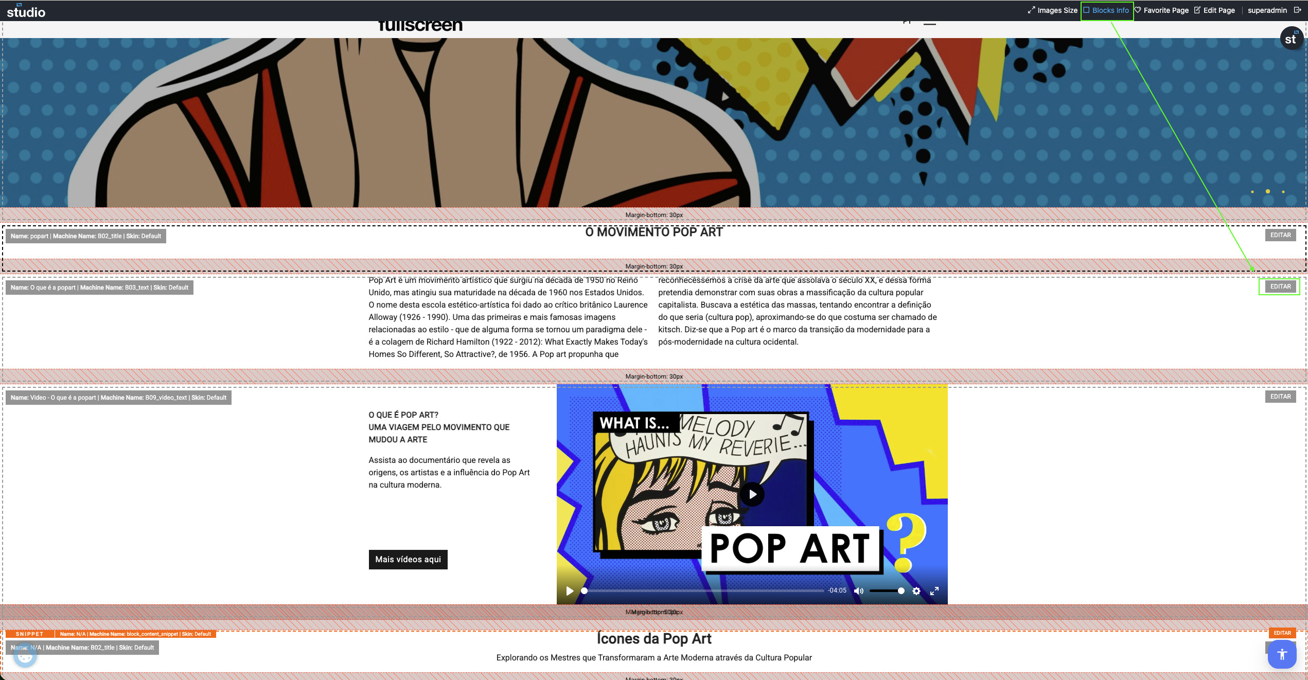
After saving, always check the result on the website. On the frontpage, you can use Images Size to validate image dimensions and optimisation, and Blocks Info to ensure you are editing the correct block.
Import / Export settings
Setup reuse
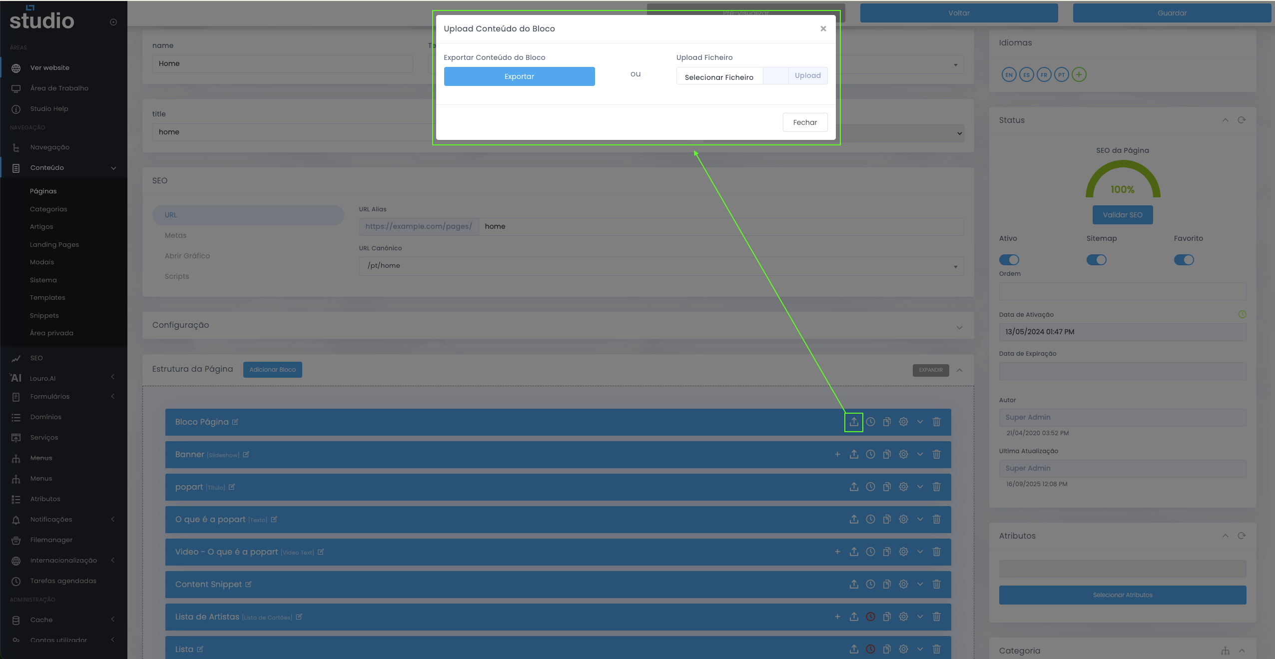
Visual example of exporting and reusing settings between blocks.
Some blocks allow you to download a configuration and later import it into another block, which is useful for replicating setups or variations that have already been tested. This feature is especially practical when you want to keep consistency across multiple similar blocks.