



Chronology Component
The Chronology section was designed to present events in chronological order, allowing you to tell stories, show milestones in development, or organize stages of an editorial journey in a clear, progressive, and visually date-oriented way.
General information
The Timeline block is a straightforward solution for structuring content chronologically. Each item acts as a milestone within the sequence, combining date , title , text , and image, allowing the user to follow a narrative, a historical evolution, or a set of phases with visual and textual context.
Each block may include:
- Global control via Skin , Disabled block , Full Width , and Offset.
- Structural fields such as Block ID , Extra Class , and Number of Items
- Items with Item Date , Item Title , and Item Text.
- main image per item with ALT and TITLE fields
- Alternative mobile image per item to adapt framing and readability on small screens.
- Control spacing and animation to integrate the timeline into the page layout.
Use this component when the order of events is part of the message and when the temporal progression helps the user to better understand the presented content.
Visual examples of the block
Three possible interpretations of the chronology.
The Chronology section can be interpreted editorially, institutionally, or procedurally, depending on how the temporal sequence is presented. The three examples below show recurring variations in visual rhythm, content density, and use of chronological markers.
When to use / When to avoid
Correct application of the component
When to use
- To present events, phases, or milestones whose chronological order is part of the message.
- When the narrative benefits from chronological progression with date, context, and image.
- For brand stories, institutional timelines, roadmaps, or project paths.
- When there is value in distributing information across multiple points in time instead of condensing it into a single block.
When to avoid
- When the items have no clear temporal relationship with each other.
- When content needs to be compared side-by-side rather than scrolled through sequentially.
- When there are few points and the chronological order adds neither reading nor context.
How to set it up in practice
Recommended work structure
Define the sequence
- Choosing the moments that truly deserve to be included in the timeline.
- Ordering events with consistent temporal logic.
- Deciding how many items are needed to tell the story without going overboard.
Prepare the content
- Fill in the Item Date , Item Title , and Item Text fields with clearly distinct roles.
- Use legible and consistent dates across all time periods.
- Write objective titles and texts with sufficient context, without becoming excessive.
Working with images
- Load the main image for each item with appropriate ALT and TITLE.
- Add Item Image Mobile when the framing needs to be adjusted.
- To ensure visual consistency between the various milestones in the timeline.
Validate the reading
- Confirm that the progression is easy to follow and that the dates serve as visual anchors.
- Testing the rhythm of the block on desktop and mobile.
- Adjust spacing and width to avoid a timeline that is too dense or too sparse.
Good content practices
Temporal clarity, synthesis, and consistency.
Dates and titles
- The date should be clear, consistent, and sufficiently visible to guide the reader.
- The item title should accurately summarize the timeframe.
- When dates change format throughout the chronology, the perception of accuracy tends to decrease.
- If the titles are vague, the chronology loses narrative power.
Text and image
- The text of the item should explain why that moment is relevant.
- A good image adds context, emotion, or visual proof to an event.
- Avoid excessively long texts per item, especially when there are multiple milestones.
- If the mobile image changes significantly, adapt the ALT and TITLE text accordingly.
Advanced settings for the Timeline component.
General structure of the block
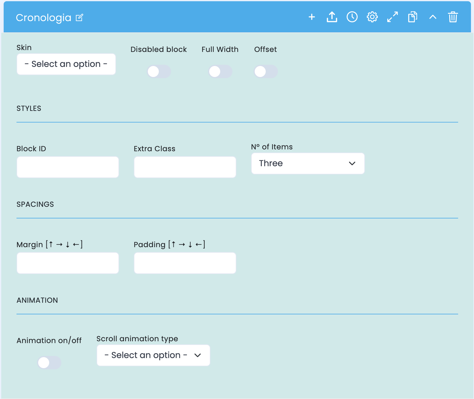
This screen brings together the overall controls for the timeline: basic block structure, technical identification, number of items, spacing, and entry animation.
Basic structure
- Skin chooses the visual variant of the block.
- Disabled block disables the timeline without deleting it.
- Full Width allows you to fill the entire available width.
- Offset helps adjust the positioning within the composition.
Organization of the block
- Block ID defines a unique anchor or internal navigation point.
- Extra Class allows for additional adjustments via CSS.
- The number of items controls how many milestones make up the timeline.
Spacing and animation
- Margin regulates the exterior space of the block.
- Padding regulates the interior space of the block.
- Animation on/off and scroll animation type control the visual input of the timeline.
Main content configuration
Date, text, and images per item.
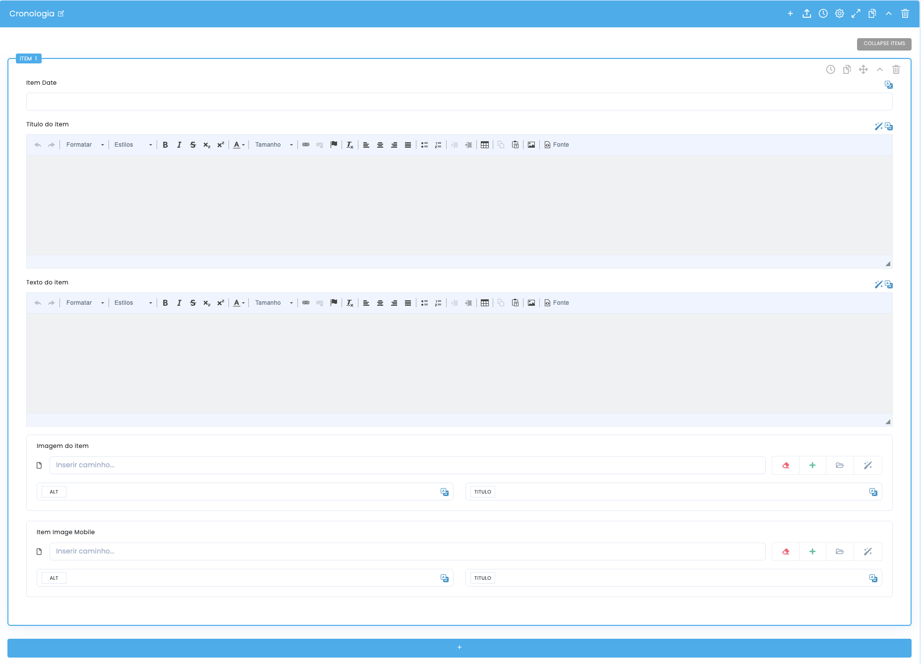
Within each item, you define the date , title , text , and images associated with that timeframe, including the specific mobile version when necessary.
Textual structure of the item
- Item Date identifies the point in time of the milestone.
- The item title presents the main idea in a concise way.
- The item text provides deeper context through a rich editor.
Image and mobile image
- The item image receives the main visual cue from the event.
- Item Image Mobile allows you to adapt the framing for small screens.
- Both versions include ALT and TITLE fields for context and accessibility.
How the chronology gains clarity
Decisions that improve reading speed
Quantity of items
- A balanced number of milestones helps to tell the story without becoming tiresome.
- Too many items dilute the importance of each moment.
Relationship between date and content
- The stronger the connection between date, title, and text, the more natural the progression will be.
- Avoid decorative dates that lack real weight in the reading of the content.
Mobile adaptation
- Alternative images and clearer text help maintain pacing on small screens.
- On mobile devices, the timeline should maintain hierarchy without becoming visually cluttered.
Related guides
Blocks linked to narratives, stages, and visual collections.