

Accordion Component
The Accordion block was designed to organize content into expandable panels, allowing you to present multiple answers, technical details, or editorial sections without overwhelming the initial page viewer. The component combines structural control, visual theme, and item-by-item opening behavior.
General information
The Accordion block is a straightforward solution for presenting information in layers, where each item has a visible title and a body of content that can be expanded when needed. It is especially useful for FAQs, specifications, policies, terms and conditions lists, customer support, or phased reading sections.
Each block may include:
- Multiple items with Title and Text field in rich editor.
- Item-based control to define whether it starts open via Item Open.
- Global settings such as Skin , No Gap , Full Width , and Offset
- Customizing the visual language with border radius , icon type , and theme colors.
- Supporting fields such as Block ID , Extra Class , Margin , Padding , and Animation.
Use this component when the priority is to facilitate the progressive retrieval of information and reduce visual noise, keeping the content available without displaying it all at once.
Visual examples of the block
Three recurring readings of the component
The Accordion block can take on very different interpretations depending on the combination of theme , icon type , spacing , and initial state of the items . The three examples below show common ways to apply the component without deviating from the same structural logic.
When to use / When to avoid
Correct application of the component
When to use
- To organize responses, conditions, policies, or technical details into searchable blocks.
- When content needs to exist on the page, but shouldn't be fully displayed at first glance.
- For sections where layered reading improves comprehension and reduces visual noise.
- When you need a repeatable pattern for multiple items with the same structural logic.
When to avoid
- When there are only one or two short content blocks and expansion adds no value.
- When the user needs to compare multiple points at the same time, and not sequentially.
- When item titles are vague and require you to open everything to understand the content.
How to set it up in practice
Recommended work structure
Define the structure
- Deciding how many items actually need to exist in the block.
- Separate the topics using clear and mutually distinct titles.
- Reserve the accordion for content that benefits from progressive reading.
Write the titles
- Use direct, specific titles that are easy to navigate in visual scans.
- Avoid generic phrases such as "More information" or "Details".
- Ensure that each header accurately promises what will be opened.
Assembling the content
- Fill the text field using a rich editor, but without creating overly large blocks.
- Use lists, subheadings, or short paragraphs to make it easier to find information.
- Define "Open Item" only in cases where it makes sense to start with an expanded point.
Validate the experience
- Check visual rhythm, contrast, and consistency between items.
- Test the block on mobile to confirm that the interaction remains clear.
- Ensure that the visual theme does not compromise the readability of the header and text.
Good content practices
Clarity, hierarchy, and usefulness
Item titles
- The title should serve as a clear promise of the content inside.
- The more easily searchable the list of headings is, the more effective the accordion will be.
- Titles that are too long hinder scanning and take up too much screen space.
- If several items seem to say the same thing, the structure probably needs revision.
Expanded text
- The body of the item should quickly resolve the question raised by the title.
- Short paragraphs, lists, and small visual blocks greatly aid reading.
- Avoid turning the accordion into a container for excessively long texts.
- If an item requires a lot of depth, it may be worthwhile to direct you to a dedicated page.
Advanced Accordion Component Settings
General structure, theme, and visual behavior.
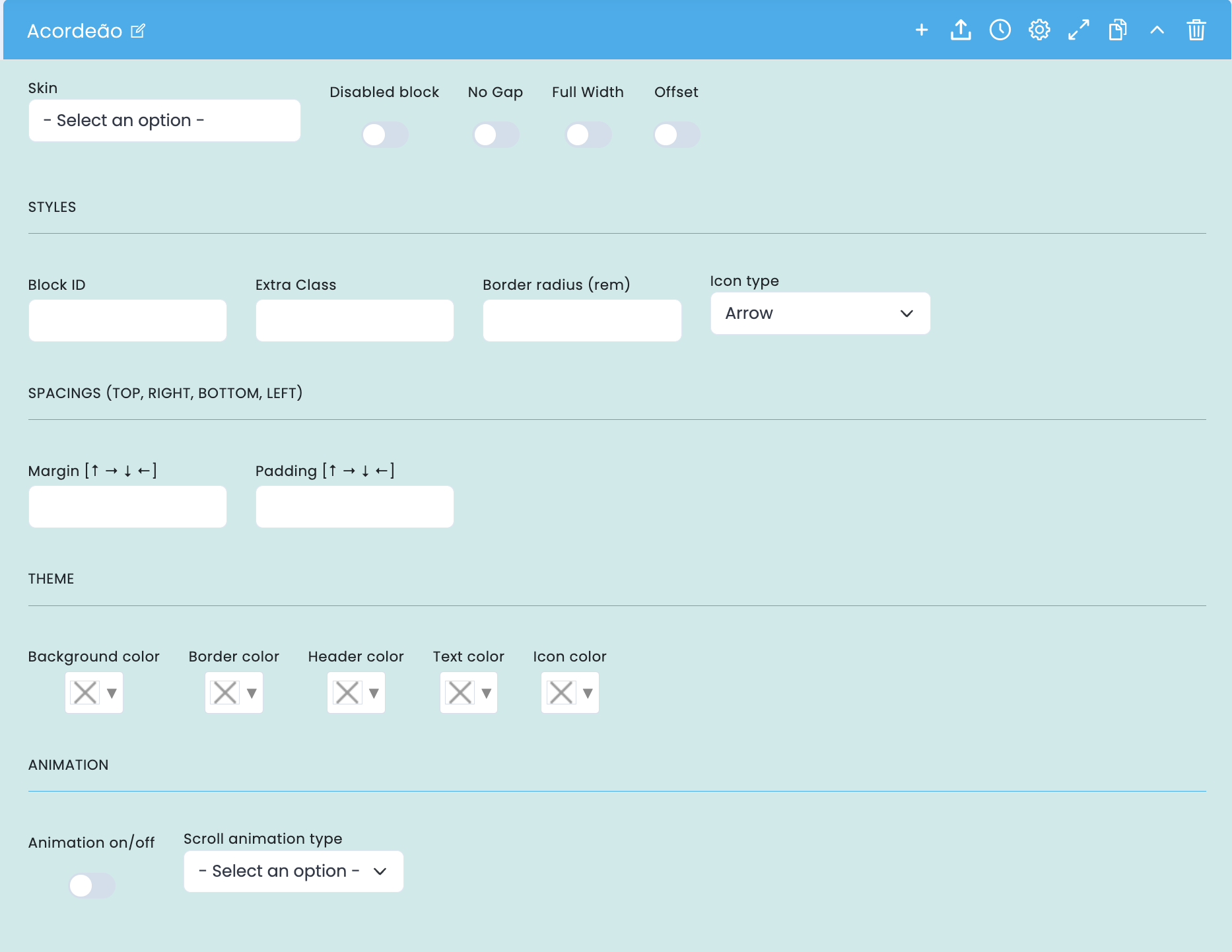
This screen centralizes the block's overall controls: basic structure, icon type, spacing, color theme, and entry animation.
Basic structure
- Skin defines the base variant of the block.
- Disabled block disables the block without deleting it.
- No Gap removes the spacing between items for a more compact reading experience.
- Full Width makes the block occupy the entire available width.
- Offset helps adjust the positioning within the page layout.
Visual style
- Border radius (rem) controls the overall rounding of the panels.
- Icon type defines the visual language of the opening indicator.
- The theme fields allow you to adjust the Background , Border , Header , Text , and Icon color.
Spacing and animation
- Block ID and Extra Class help with anchors, specific adjustments, and integration with CSS.
- Margin and padding fine-tune the block's fit to the rhythm of the page.
- The animation on/off and scroll animation type controls the visual input of the component.
Main content configuration
Title, text, and initial state of each item.
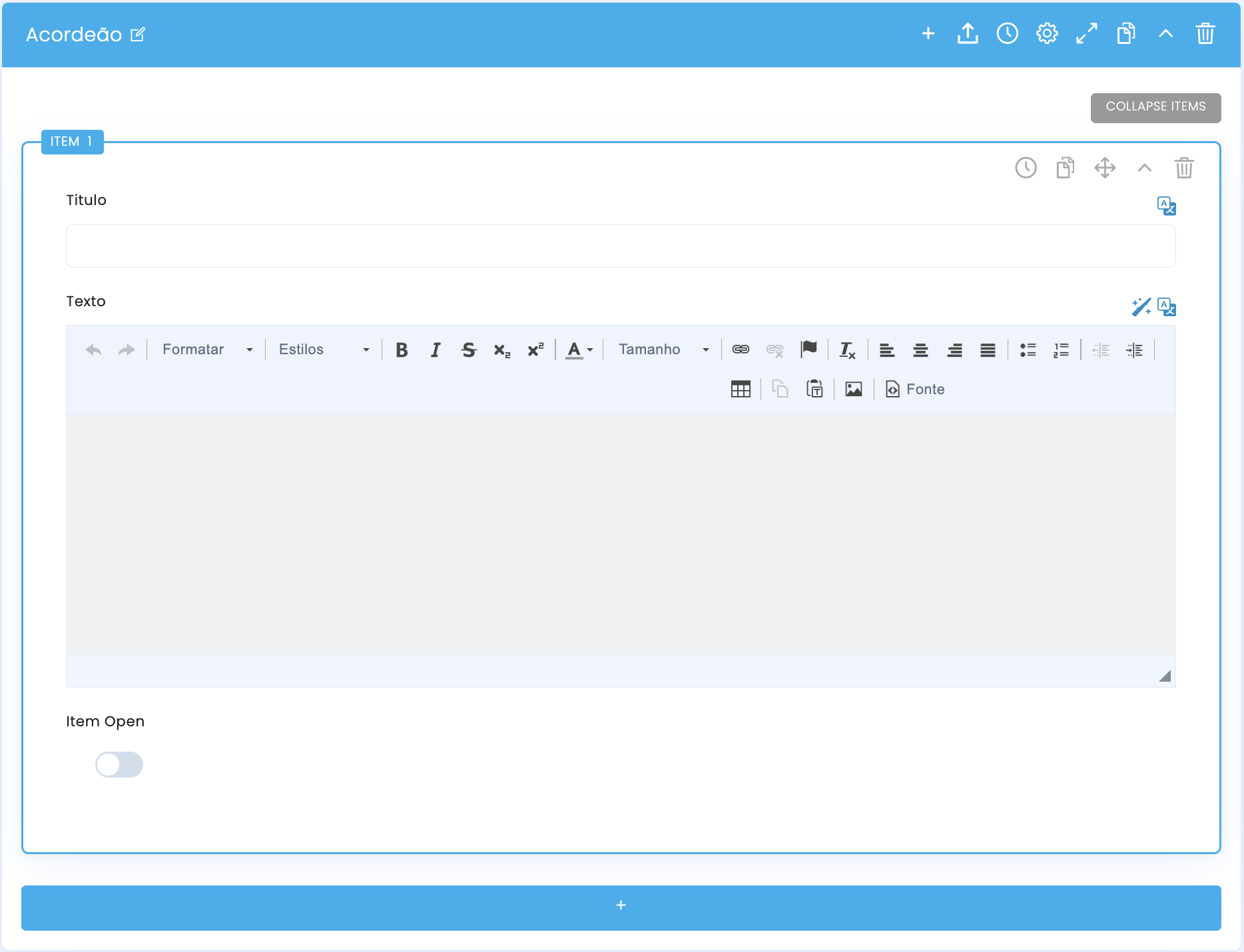
Within each item, you define the Title , the Text field with rich editor, and whether that item starts open via Item Open .
Title and text
- The Title field functions as a clickable header for the item.
- The Text field receives expanded content with a rich editor, allowing for lists, formatting, and more structured blocks.
- It is important to maintain consistency of tone and depth between items within the same block.
Item Open
- Item Open determines whether the item starts open on initial load.
- Use this option judiciously, usually to highlight the first point or the most important information.
- If multiple items open unnecessarily, the block loses its progressive reading logic.
Visual behavior of the accordion
Decisions that change the interpretation of the component.
No Gap
- It creates a denser and more continuous reading flow between items.
- It usually works well with extensive FAQs, technical documents, and utility lists.
Icon type
- It helps to reinforce the perception of interaction and the type of visual language on the page.
- Arrows suggest navigation; plus and minus signs reinforce the logic of opening and closing.
Chromatic theme
- The colors of the header, text, and icon determine the visual impact of the block.
- More contrasting themes make the accordion a standout element; softer themes leave it more neutral.
Related guides
Blocks with similar logic in terms of structure and readability.