
How to use this page
The dashboard does not replace a detailed analysis of the other areas, but it helps decide where to look first. It is the panel that summarises the state of the operation and works well as a first reading of the day, the start of the week or a performance review moment.
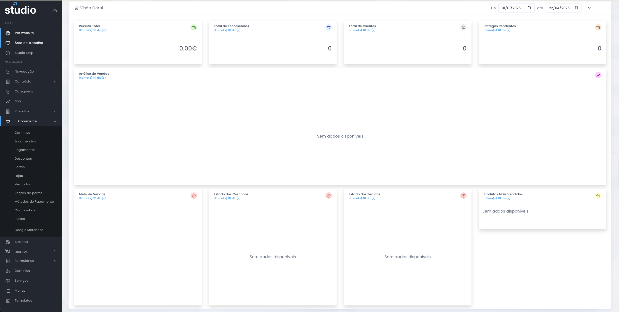
Dashboard overview
Starting point for analysis
This is where the team first answers questions such as: were there sales during the period, how many orders came in, are there active customers, are there pending deliveries and which parts of the commercial cycle need immediate attention.
What the top indicators help reveal
Quick executive reading
Revenue indicators
- Total revenue helps show the value sold during the selected period.
- Total orders shows the volume of completed purchases.
Operational indicators
- Total customers helps contextualise the commercial reach.
- Pending deliveries shows whether there is operational pressure or accumulated delay.
Complementary dashboard blocks
Analysis and extra context
Sales analysis
Helps observe change over time and identify whether there is a growth, drop or stagnation trend.
Sales target
Creates context between objective and reality, useful for reading performance and commercial expectations.
Cart status
Helps interpret the pre-conversion phase and see whether there is purchase intent without completion.
Order status
Shows the operational distribution of orders and helps detect accumulation in specific statuses.
Best-selling products
Reveals demand behaviour and helps connect commercial results with the catalogue and campaigns.
Combined reading
The real value of the dashboard appears when these blocks are read together rather than separately.
Importance of the selected period
Time context of the analysis
The dashboard includes date filters, so every conclusion depends on the selected range. A correct reading always requires validating the start date, the end date and the commercial context active during that period.
- An active campaign may explain a peak in orders or revenue.
- A very short period may hide patterns that only appear over a larger window.
- An excessively long period may mix different behaviours and make interpretation harder.
How to investigate from the dashboard
From summary to action
1. Identify the signal
Start by understanding which block looks out of the expected range: revenue, orders, deliveries, carts or the mix of statuses.
2. Look for the likely cause
Use the anomaly as a clue to dig deeper into orders, carts, discounts, shipping or campaigns.
3. Confirm in detail
The dashboard summarises, but real validation happens in the operational areas where records and rules can be reviewed in detail.
Explore also
Areas for deeper analysis