



HTML component
The HTML block was designed to insert custom markup within the page when the project needs a technical or editorial layer that doesn't exist in another component. It allows you to paste HTML code directly into the main field and combine that output with Skin, Full Width, Block ID, Extra Class, spacing, and animation.
General information
The HTML block is a flexible solution for introducing custom structures into the frontend without relying on a more closed block. It works well for controlled snippets, specific embeds, technical banners, third-party wrappers, or small editorial compositions that need complete markup freedom.
This block may include:
- A primary HTML field for pasting custom markup.
- Structural control via Skin , Disabled block , and Full Width.
- Block identification using Block ID and Extra Class
- Margin and padding adjustments for page fit.
- Animation on/off control and Scroll animation type
Use this component when there is a real need for customization and the team knows exactly which HTML needs to be rendered. It is especially useful for technical integrations, special promotional messages, controlled external widgets, or micro-layouts that do not justify the immediate creation of a new dedicated component.
Visual examples of the block
3 typical scenarios for embedded HTML
The HTML block can be interpreted in quite different ways because its presentation depends on the markup inserted in the main field. The three examples below show common ways to use it without deviating from the component's basic logic.
When to use / When to avoid
Correct application of the component
When to use
- For promotional snippets, technical wrappers, or small structures that don't exist in another block.
- For external widgets, iframes, special embeds, or markup that requires manual integration.
- When the team knows exactly which HTML needs to be rendered and can maintain it safely.
- For quick responses to specific needs without immediately starting the development of a new component.
When to avoid
- When a native ad block already addresses the need with more editorial consistency and less technical risk.
- When content is going to be repeated many times and deserves to become its own component.
- When the code relies on fragile scripts, excessive styles, or is difficult for the content team to maintain.
How to use it in practice
Recommended workflow
Define the need
- Confirm whether the project actually needs custom HTML and if there isn't a more suitable block already.
- Determine if the objective is editorial, technical, or a third-party integration.
Prepare the code
- Organize the snippet before pasting it into the main field.
- Avoid unnecessary markup, chaotic styles, or weak dependencies.
Adjust the block
- Define Skin , Full Width , Block ID , and Extra Class according to the context.
- Use margins and padding to integrate the HTML into the overall rhythm of the page.
Validate in preview
- Testing responsiveness, line breaks, script behavior, and visual impact on the frontend.
- Confirm whether the animation enhances the reading experience or if the block works better in a static format.
Good coding practices
Clarity, maintenance and security
Structure and readability
- Write clean HTML, without redundant elements or confusing classes.
- If the block includes text, maintain a clear semantic hierarchy for headings, paragraphs, and links.
- When the solution grows too large, it's a sign that the project might need a new component.
Compatibility and control
- Always validate mobile behavior, especially if there are iframes, tables, or internal columns.
- Pay attention to external scripts, inline styles, and conflicts with the rest of the page.
- If the snippet comes from a third party, carefully test its performance, accessibility, and visual impact.
Advanced HTML component settings
Structure, spacing, and animation
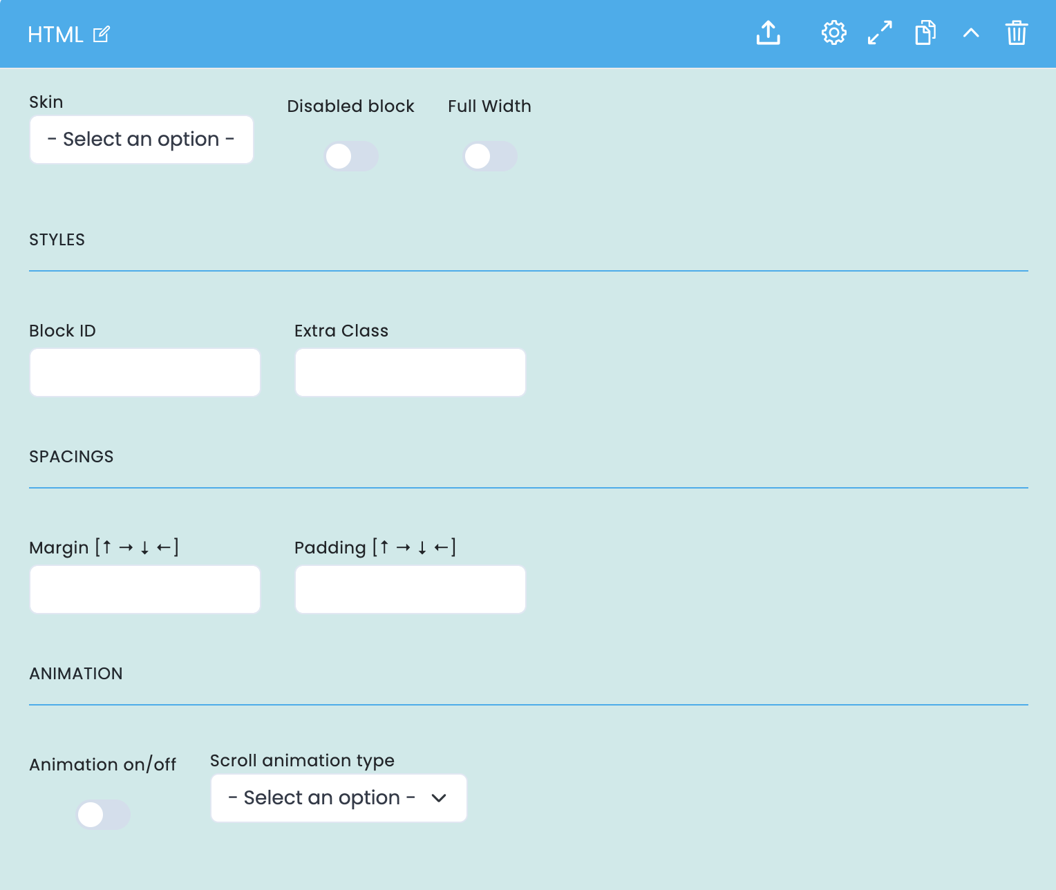
These options control how the HTML block fits into the layout: visual variant, width, structural identification, spacing, and animation.
Block structure
- Skin defines the base visual variant of the component.
- Disabled block allows you to disable the block without removing it.
- Full Width makes the snippet occupy more width within the composition.
Identification and fitting
- Block ID helps with anchors, internal navigation, and technical references.
- Extra Class allows you to add an additional class for specific adjustments.
- Margin and padding refine the relationship of the block to the rest of the layout.
Animation
- Animation on/off activates or deactivates the animated block entry.
- Scroll animation type defines the motion language applied in the frontend.
- Use animation only when it reinforces readability and does not complicate the understanding of the rendered HTML.
Main content configuration
HTML field and implementation logic
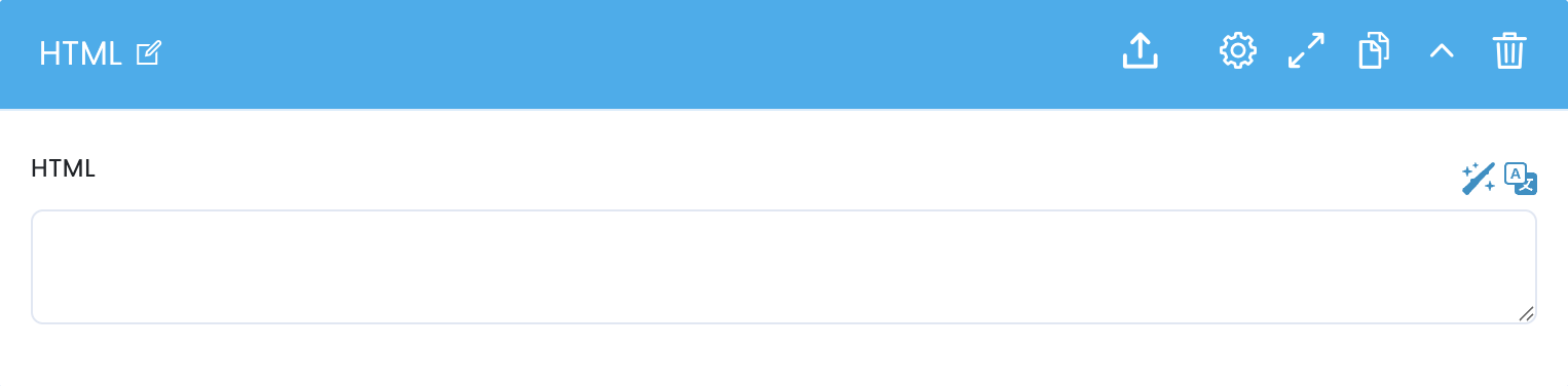
In the main block configuration, there is a single HTML field. This is where you define the markup that the component will render on the frontend.
HTML field
- The HTML field receives the complete snippet that will be rendered in the block.
- It can contain simple structures, wrappers, promotional messages, iframes, or controlled embeds.
- The clearer and more concise the code, the more stable it will be for future maintenance.
Technical review
- After pasting the code, it's advisable to check responsiveness, styles, and external dependencies in preview.
- If the snippet includes JavaScript, iframes, or third-party integrations, the final review should be especially thorough.
- It is also important to confirm that the solution remains compatible with the overall page structure.
Related guides
Additional context for this block