



Attribute List Component
The Attribute List block was designed to quickly and neatly display the values of a specific attribute within the page. It allows you to choose which attribute to list, define the display style (horizontal or vertical), and adjust the block's basic structure with options for skin, technical identification, and spacing.
General information
The Attribute List block is a straightforward solution for exposing a set of values associated with an attribute without needing to manually build a structure item by item. It works well for technical characteristics, classification tags, product properties, descriptive filters, or short lists of editorial support.
This block may include:
- Selecting the attribute via the Attribute to List field.
- Defining the visual pattern with List Style , typically horizontal or vertical.
- Structural control via Skin , Disabled block , Block ID , and Extra Class
- Integration adjustments in the layout with Margin and Padding
Use this component when you need to display an attribute consistently, reusing information already existing in the system. It is especially useful on product pages, catalogs, datasheets, decision support blocks, or sections where the user needs to quickly identify a set of related values.
Visual examples of the block
3 possible interpretations of the same logic
The Attribute List block can be interpreted differently depending on the type of values presented and the style chosen in List Style . The three examples below show how the same logic can serve faster, more technical, or more editorial contexts.
When to use / When to avoid
Correct application of the component
When to use
- To present the values of an existing attribute in a clear and reusable way.
- When you need to display materials, features, tags, properties, or ratings.
- When you want to avoid manually repeating the same list on multiple pages.
- When information gains value by being grouped in a consistent horizontal or vertical arrangement.
When to avoid
- When information needs its own order, narrative, or hierarchy that doesn't depend on an attribute.
- When the values are too long and require a more developed block of text.
- When the content to be displayed does not exist as a structured attribute in the system.
How to use it in practice
Recommended workflow
Choose the attribute
- Confirm which attribute is correct for the page's needs.
- Check if the values of this attribute are up-to-date and consistent with each other.
Define the style
- Use horizontal List Style for short values and immediate readability.
- Use vertical List Style when values need more space or greater readability.
Adjust the structure
- Configure Skin , Disabled block , Block ID , and Extra Class according to the layout.
- Use margin and padding to integrate the block into the overall rhythm of the composition.
Validate in preview
- Confirm that the number of values remains legible in the available space.
- Check if the horizontal or vertical style remains consistent across desktop and mobile devices.
Good content practices
Consistency, usefulness, and readability
Quality of values
- Ensures that attribute values follow the same writing logic and the same level of detail.
- Avoid mixing very short values with overly long descriptions within the same list.
- If abbreviations exist, confirm that they make sense for the page's audience.
Style choice
- Prefer the horizontal style when the function is to summarize, filter, or enhance quick reading.
- Prefer the vertical style when the function is to explain, detail, or accommodate more extensive values.
- Do not force too many values onto a single line if this compromises the readability of the entire dataset.
Advanced settings for the Attribute List component
Basic structure and integration into the layout
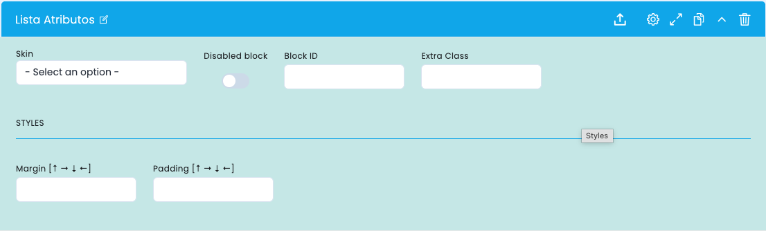
These options control the block's basic structure, its technical identification, and how it fits into the rest of the layout.
Basic structure
- Skin defines the base visual variant of the component.
- Disabled block allows you to disable the block without removing it.
- Block ID helps with anchors, internal navigation, and technical references.
- Extra Class allows you to add an additional class for specific adjustments.
Spacing
- Margin controls the distance of the block in relation to the exterior elements.
- Padding controls the internal respiration of the contents.
- These fields help the block breathe better in denser or more open compositions.
Reading in the layout
- The combination of structure and spacing determines whether the list reads as a technical detail or as a visual aid.
- A more contained layout usually works better when the list appears between other informational blocks.
- A more open configuration helps when values need to stand out on their own.
Main content configuration
Attribute to list and presentation type
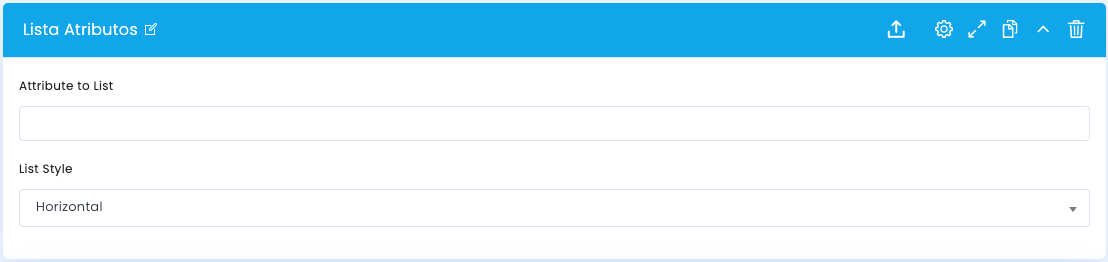
In the main block configuration, you define which attribute should be displayed and how it will be presented to the user.
Attribute to List
- The Attribute to List field indicates which attribute's values will be displayed in the block.
- It is important to choose an attribute that is already correctly filled in and consistent with the content or products where it will be used.
- The more consistent the source of the values, the more robust the final presentation will be.
List Style
- The List Style field defines whether the values appear in a more horizontal or more vertical logic.
- Horizontal layout works best for short, compact lists that need to be read quickly.
- Vertical text works best when values need more space, more separation, or greater readability.
Related guides
Documentation that may complement this section.