
Image Component
The Image block was designed to highlight a single image with presentation control within the page. It allows you to define desktop and mobile versions, choose size, alignment, zoom behavior and destination link, while keeping ALT and TITLE associated with the block itself.
General information
The Image block is a straightforward solution for inserting a single visual element with control over how it occupies the layout. It is suitable for simple banners, editorial highlights, institutional images, campaign assets or moments when a visual needs to stand out without any repetition logic.
Each block can include:
- main image for desktop
- specific image for mobile
- ALT and TITLE fields in each version
- size control through the Type field
- block alignment within the composition
- link, target and zoom option
Use this component when the image has enough impact on its own and needs to be presented as a standalone unit, without the complexity of a slideshow, gallery or multi-item structure.
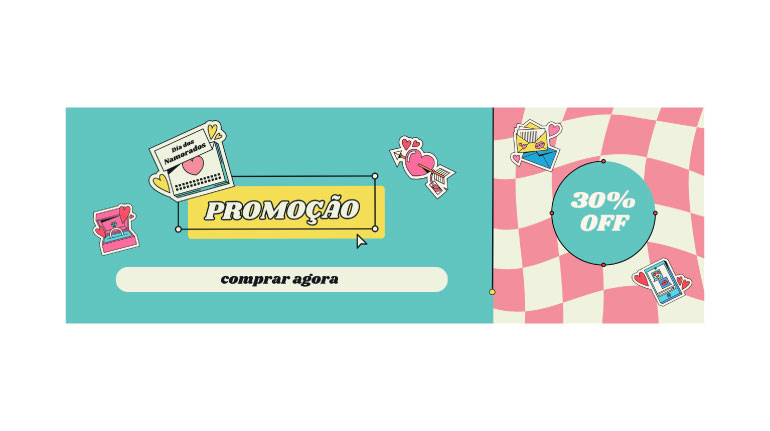
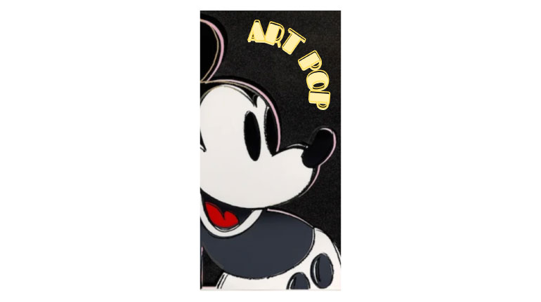
Visual examples of the block
Layout and composition variations
The Image block can take on different visual interpretations depending on the combination of Type, Align, Full Width, Zoom and Link. The slideshow below follows the same logic as the model and uses real back-office screenshots to show different ways of configuring this component.

When to use / When to avoid
Correct application of the component
When to use
- To give focus to a standalone image with editorial relevance
- To create a simple visual highlight without multiple items
- To insert a clickable asset that directs the user to another page
- To work with desktop and mobile versions separately
When to avoid
- When you need multiple images in sequence or rotation
- When the message depends more on text than on the image
- When the image is purely decorative and does not need its own block
How to use it in practice
Recommended workflow
Prepare the assets
- Choose the main image with sufficient quality
- Prepare a mobile version if the crop or composition changes
- Confirm that the file is optimized and consistent with the context
Fill in the block
- Upload Image and Image Mobile
- Fill in ALT and TITLE in each version
- Define the link only if there is a clear destination
Adjust the presentation
- Choose the most suitable Type: Small, Medium or Full
- Define Align according to the page composition
- Use Full Width only when the image should take on more prominence
Validate in preview
- Test the crop and readability on desktop and mobile
- Check whether zoom adds real value
- Confirm that the target and click behavior make sense
Content best practices
Focus, context and legibility
Image choice
- One image per block should match a clear editorial intention
- Avoid images with too much embedded text or unreadable information
- Choose a scale that is consistent with the importance of the content
- If the image does not have enough impact on its own, it may not need this block
Accessibility and context
- ALT should describe what the image shows or the role it fulfills
- TITLE helps as contextual reinforcement, but it does not replace good ALT
- If the mobile version changes significantly, adapt ALT and TITLE to that reality
- If the block has a link, the destination should be consistent with the visual expectation created
Advanced settings of the Image component
Image + summary of the options
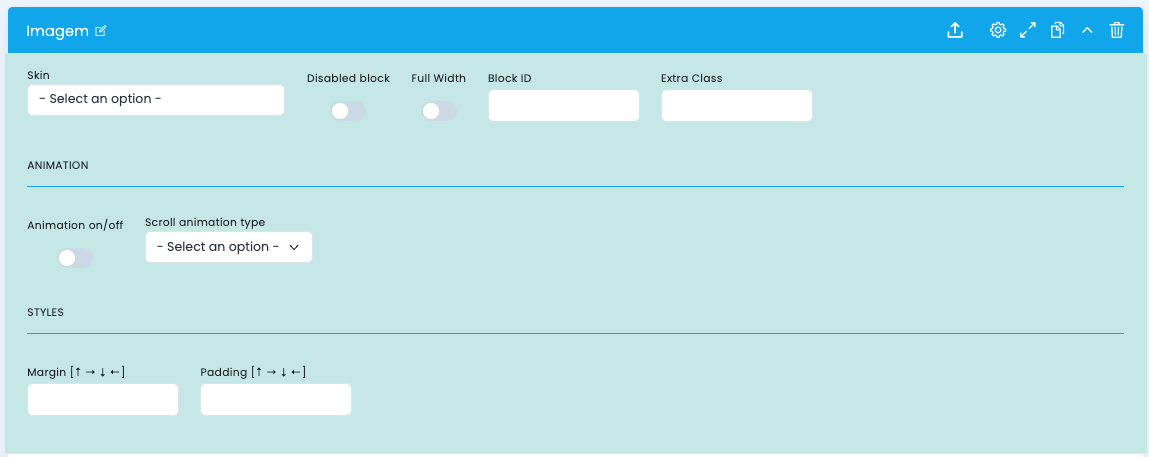
These options control the base structure of the block, the width it occupies, the animation and the overall spacing.
Structural configuration
- Skin chooses a visual variant of the block
- Disabled block disables the block without deleting it
- Full Width makes the image occupy the full available width
- Block ID defines a unique ID for anchors or internal navigation
- Extra Class adds a specific class for additional adjustments
Animation
- Animation on/off enables or disables the entrance animation
- Scroll animation type defines the type of animation applied to the block
- Use animation only when it reinforces readability and does not distract from the image
Spacing
- Margin controls the outer spacing of the block
- Padding controls the inner spacing of the block
- These fields help fit the image into the overall rhythm of the page
Main content configuration
Desktop image, mobile image and metadata
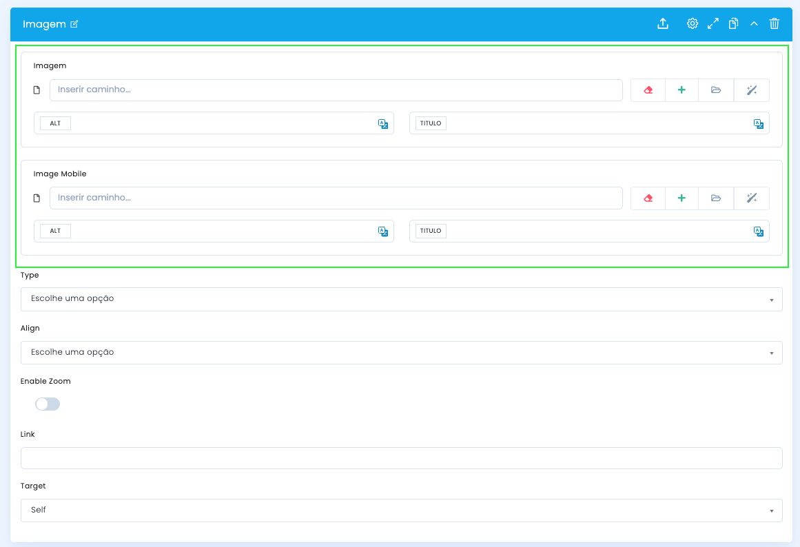
In the main block configuration, you define the two base assets and their respective context fields.
Image and Image Mobile
- Image receives the main asset used on desktop
- Image Mobile allows you to upload a specific version for small screens
- If the framing changes a lot between formats, it is worth preparing two different assets
ALT and TITLE
- The ALT and TITLE fields exist in each version of the image
- ALT should describe the image or its role in the context of the page
- TITLE can work as contextual reinforcement, without becoming artificially repetitive
Presentation and interaction settings
Size, alignment, zoom and link
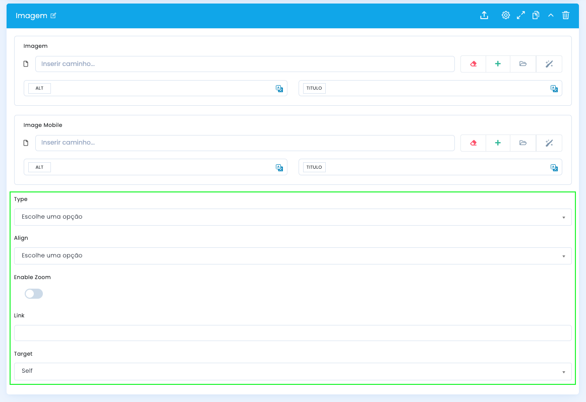
After defining the assets, you adjust the visual scale, the alignment and the interaction layer of the block.
Type
- Small for more contained use
- Medium for balance between emphasis and rhythm
- Full when the image should gain more presence
Align
- The screenshot shows options such as Center and Right
- Choose the alignment according to the image crop and the page composition
Enable Zoom
- Enable zoom when the image has detail that justifies a closer view
- Avoid using zoom on purely decorative or quick-impact images
Link and Target
- Link defines the click destination
- Target controls the opening behavior, such as Self or New Page
- If the image does not have a clear destination, it is preferable not to force a link
Demo and downloads
Examples and settings