Studio Help · Blocks

Component List

The List block was designed to list dynamic content from Studio CMS based on a source configured in the back office. It allows you to define content type, category, template, quantity, sorting, pagination, levels, columns, carousel, and visual rules for the section, while maintaining a direct link to existing content.


General information

The List block is a dynamic solution for presenting existing content in the CMS in a grid or carousel format. Instead of manually building cards one by one, this component retrieves content based on a defined source and applies the same visual logic to the whole, making it especially useful for news, articles, pages, resources, thematic listings, or frequently updated editorial sections.


This block may include:


  • Defining the origin through Content Type , Category , Content Type Skins , and Template.
  • Quantity control through Number of Items , ASC/DESC , Pagination and Number of Levels
  • Presentation adjustments with Number of Columns , Gap , Image height (px) , and Align Caption.
  • options like Hide Date , Hide Caption , Hide Buttons , Button label and Button Style
  • visual control with Background Color , Background Color Item , Color Item , Card border radius and Image border radius
  • Independent carousel rules for Desktop , Laptop , Tablet , and Mobile , plus filters such as Date on/off and Search on/off.

Use this component when you need to automatically pull content and present it with a consistent structure, without losing control over the grid, navigation, and device experience. It's especially useful when the value lies in continuously updating the list rather than manually building each item.


Visual examples of the block

3 recurring readings of the same logic

The List block can be interpreted differently depending on the origin of the content and how you want to present it: editorial grid, carousel layout, or list with search and pagination support. The three examples below show frequent uses of the same component base.

Desktop · 3 columns Date on/off · active Caption visible
Article
How to organize content by category

Example of an item automatically listed from an editorial source, with image, date, summary, and reading action.

News
Campaign update with dynamic listing

The grid allows you to display multiple pieces of content simultaneously, providing a stable and easy-to-compare reading experience between items.

Guide
Content listed with consistent hierarchy.

The block maintains the same visual logic even when the content comes from a dynamic list and not from manual input.

Example 01 - Editorial grid with visible date

Suitable for displaying news, articles, resources, or recent pages where the list needs to show multiple pieces of content simultaneously, supported by dates and short summaries.

Active Carousel Slides to show · 2 Dots + Arrows

Example 02 - Highlights in carousel

This setting is useful when the list is longer, when you want to reduce visual density per breakpoint, or when it makes sense to present the content progressively.

Search on/off Paginate Button label
Search
Item returned by a filtered query.

A good read for lists where the user needs to quickly find specific content within a larger set.

Search Open
Page 1
List with active pagination

As the volume of content grows, pagination helps organize navigation without making the section too cumbersome.

Paginate Next
Template
Content pulled with specific rules

The block allows you to refine the source of the listing by template or by type of content to be listed, according to the editorial context.

Levels Category
Action
Button configured to the scale of the set.

The button can maintain consistent language across all items, eliminating the need to edit each card manually.

Primary Primary

Example 03 - Filterable list with pagination

Suitable reading for more utilitarian sections, content libraries, or areas where research, pagination, and dynamic source code play a central role.

When to use / When to avoid

Correct application of the component

When to use

  • To list dynamic content such as news, articles, pages, resources, or editorial collections already existing in the CMS.
  • When does it make sense to control the listing source by content type , category , template , or navigation depth?
  • For sections that need to adapt grid, carousel, dates, legends, and pagination by device.
  • When the value is automatically updated in the list and not manually generated for each item.

When to avoid

  • When you need to manually build each item with its own fields that are very different from each other.
  • When the section has only a single highlight and there is no real logic to the listing or repetition.
  • When the source of the content is not sufficiently organized, the list ends up returning inconsistent results.
In this case: if you need to create entirely manual cards with very different content, a Card List , Tile, or Gallery block might be more suitable. The List block gains value when there is a real dynamic source behind the presentation.

How to set it up in practice

Recommended workflow

Define the origin

  • First, decide what type of content the list should pull and whether the source also depends on Category or Content Type Skins.
  • If the listing is too open, it's worth refining the query before changing the layout.

Define the query.

  • Configure the type of content to list , template , number of items , ASCII/DESCIDence , pagination , and number of levels.
  • Confirm that the requested depth and quantity make sense for the experience you want to create.

Define the presentation

  • Adjust the number of columns , gap , and image height (px) to decide where the grid should remain static or switch to a carousel.
  • Fine-tune Align Caption , colors, filters, and rays to ensure clean and consistent readability across all items.

Validate the behavior

  • Test the section on Desktop, Laptop, Tablet, and Mobile to see if the list density remains balanced.
  • Confirm whether Hide Date , Hide Caption , Search on/off, and Pagination are helping the reader instead of hindering them.

Good content practices

Editorial clarity, origin, and readability.

Origin and coherence of the list

  • Before publishing the list, confirm that the Category , Template , and content type chosen return truly relevant results.
  • A dynamic list gains strength when the returned items have a clear editorial relationship with each other.
  • If the set is too heterogeneous, the problem is usually in the configured origin and not in the layout.

Reading and browsing

  • Use Hide Date , Hide Caption , and Hide Buttons only when the information doesn't add real value to the context.
  • If the list has many items, the combination of Paginate and Search on/off can make navigation more efficient.
  • The background and text colors must maintain sufficient contrast so that the overall design remains legible in any layout state.
Best practice: think first about the quality of the source and only then about the list's design. When the content selection is well done, the list almost always becomes clearer and more useful with much less visual effort.

Advanced settings for the List component

Overall structure, items, styles, carousel, and filters.

Advanced list block settings

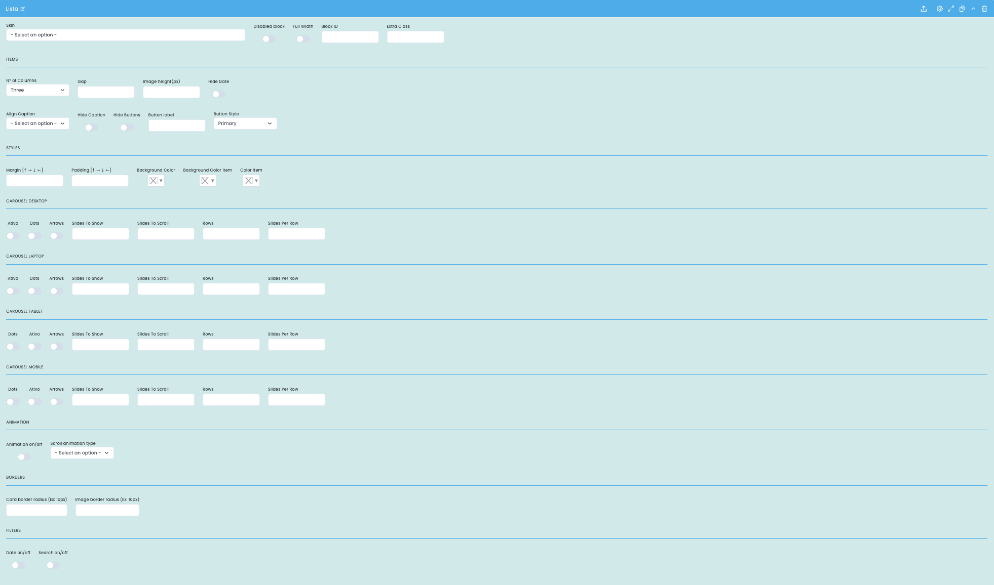
This screen focuses on the block's basic structure, item display rules, list visual styles, device-based carousel logic, and general section filters.

Block structure

  • Skin , Disabled block , Full Width , Block ID , and Extra Class define the structural framework of the section.
  • These fields are important for fitting the list into the overall page layout and for linking the block with specific anchors or classes.

Presentation of the items

  • Number of Columns , Gap , Image height (px) , and Align Caption adjust the density and visual proportion of the list.
  • Hide Date , Hide Caption , Hide Buttons , Button Label , and Button Style help simplify or enrich readability depending on the context.

Styles and borders

  • Margin , Padding , Background Color , Background Color Item , and Color Item refine the visual identity of the section and its items.
  • Card border radius and image border radius help adapt the list to a softer, more neutral, or promotional tone.

Carousel and filters

  • Desktop, Laptop, Tablet, and Mobile devices can independently enable or disable the carousel, with options for Dots , Arrows , Slides To Show , Slides To Scroll , Rows , and Slides Per Row.
  • The Date on/off and Search on/off controls help you decide whether the list should have a more editorial or more utilitarian behavior.

Main content configuration

Editorial origin, quantity, ordering and depth

Setting the content of the list block

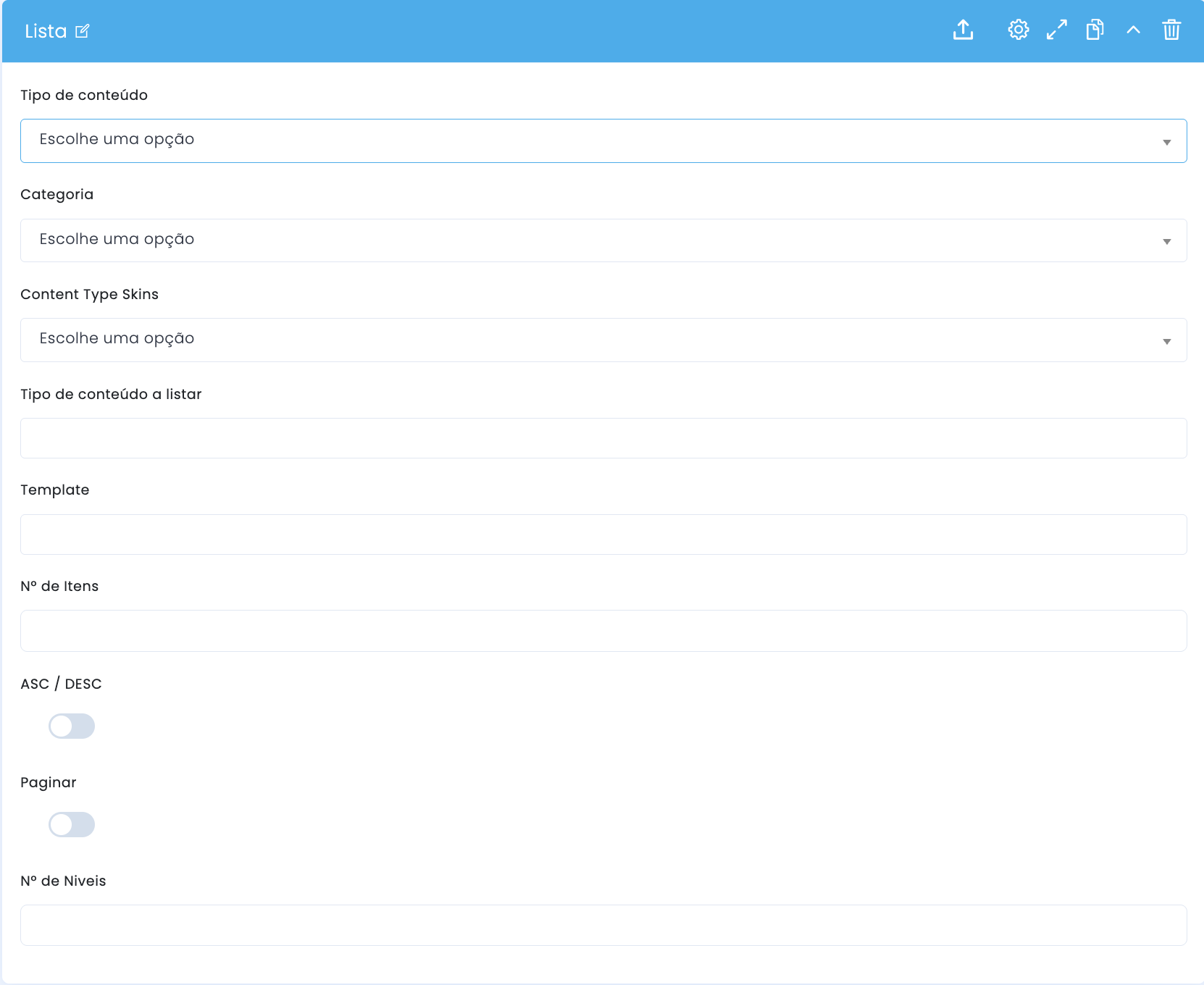
In the main configuration, you define the list's origin, the universe of content to be returned, the number of results, the sorting, and the navigation depth of the section.

Content type

  • Content type and category help to limit the source of the listing and ensure consistency between the returned results.
  • Content Type Skins allows you to further refine the universe of content when the editorial structure warrants it.

What to list

  • The type of content to list defines the specific nature of the items that the list should return.
  • Templates help to further restrict the origin when there are different variants within the same content type.

Quantity and order

  • The number of items defines the maximum volume of results returned by the list.
  • ASC/DESC controls the sorting direction and helps decide whether the list should show the most recent, oldest, or other equivalent logic.

Pagination and levels

  • Paginating enables the division of results into pages when the collection is larger and requires phased navigation.
  • The number of levels helps control the depth of returned content, especially when the editorial tree hierarchy is relevant.

Related guides

Additional context for this block