


Studio Help · Blocks

Card List Component

The Card List block was designed to organize recurring sets of cards with images, titles, text, buttons, files, and links within a responsive grid or carousel logic. It allows you to control columns by device, alignment, colors, radii, navigation, and block behavior without losing editorial consistency.


General information

The Card List block is a modular solution for presenting various content with the same visual hierarchy: an image, a small frame, supporting text, and an associated action. It works well for services, benefits, categories, resources, downloads, campaigns, teams, short testimonials, or any collection that needs repetition with visual order.


This block may include:


  • A general title for the section and several repeated cards within the same structure.
  • Image , Label , Text , BT Label , and File fields on each card.
  • Connections via Link , Target , and URL ext , with support for internal and external destinations.
  • control of Background color , Text color , Button Style , Image border radius and Card border radius
  • Defining the number of columns on Tablet , Laptop , and Desktop.
  • Independent carousel rules for Desktop , Laptop , Tablet , and Mobile , including Skin , Offset , Full Width , and animation.

Use this component when you need a collection of cards with a consistent visual rhythm and adaptability across devices. It's especially useful when you want to balance repetition, flexibility, and more dynamic navigation without resorting to a block designed solely for a single highlight piece.


Visual examples of the block

3 recurring readings of the structure

The Card List block can function as a static grid, a promotional set with navigation, or a collection of resources with different actions per card. The three examples below summarize common ways to use the same component base in different contexts.

Desktop · 3 columns Align · Center Button Style · Primary
Highlight
Editorial business card focused on benefits.

This book is ideal for presenting value propositions, advantages, or categories with a short and objective message.

Service
Second card within the same grid

Controlled repetition helps to compare blocks of information without losing visual hierarchy.

Campaign
Third card with the same reading pace

The component maintains the same image, text, and button layout while distributing the content across multiple columns.

Example 01 - Editorial highlight grid

Suitable for displaying services, categories, benefits, or institutional highlights where the collection needs to appear simultaneously, with a stable hierarchy and easy comparison between cards.

Active Carousel Slides to show · 2 Dots + Arrows

Example 02 - Promotional carousel with cards

This configuration is useful when the collection is larger, when the section needs more breathing room in a narrower width, or when it makes sense to present the content via progressive navigation.

Label + BT Label File Target
Download
Card with attached resource and CTA.

You can add supporting text, a link, and a useful file to further enhance the user's experience.

Attached PDF Learn more
Appeal
Support card for internal use.

Good reading for document libraries, campaign kits, or support materials.

XLS Open page
External
Linking to an external URL and using a custom target.

It allows the user to be taken to a destination outside the website without losing the visual structure of the collection.

URL ext New page
Content
Card with controlled color and style.

The color fields, alignment, and radii help adapt the collection to more institutional or promotional languages.

Color Primary

Example 03 - Cards with file and supporting action

Suitable for reading resources, downloads, documentation, catalogs, technical data sheets, or cards where the main action does not depend solely on an internal page.

When to use / When to avoid

Correct application of the component

When to use

  • To present services, benefits, categories, features, teams, highlights, or campaigns with the same repeated visual logic.
  • When does it make sense to combine Image , Text , BT Label , and Link on multiple cards within the same section?
  • For collections that need to change the number of columns per device and, at some breakpoints, switch to a carousel.
  • When consistency between cards is more important than the isolated prominence of a single piece.

When to avoid

  • When you only have one standout piece of content and don't need repetition or comparisons between multiple cards.
  • When each item has a structure that is too different, the whole thing ceases to function as a coherent visual family.
  • When the text on each card becomes too long and the block starts behaving more like a heavy editorial listing than a visual collection.
In this case: if the section only has one image with supporting copy, an Image, Mosaic, or Video + Text block might be more straightforward. The Card List gains value when there is a real logic of repetition between various pieces of content.

How to set it up in practice

Recommended workflow

Define the hierarchy

  • It begins by deciding what the role of the section's overall title is and what each card really needs to communicate.
  • If all the cards don't have the same kind of visual weight, it's worth reviewing the composition before building the grid.

Prepare the content

  • Organizes Image , Label , Text , BT Label , and File consistently across multiple cards.
  • Confirm whether each card will point to a Link , Target , or URL extension , and whether this decision makes sense for the user.

Define the grid

  • Adjusts the number of columns per device and decides where the grid should remain static or switch to a carousel.
  • Align , Align Content , colors, and rays to ensure clean and consistent reading.

Validate the behavior

  • Test the section on Desktop, Laptop, Tablet, and Mobile to see if the card density remains balanced.
  • If a carousel is active, confirm that the navigation, height, and scroll rate actually aid reading.

Good content practices

Editorial clarity, consistency, and action.

Structure of each card

  • The label should help to categorize or contextualize, without competing with the main title of the card.
  • The text should be short, clear, and proportionate to the available space; the Card List doesn't benefit from excessively dense blocks.
  • The BT Label should name the action precisely, rather than resorting to vague or generic calls to action.

Image, connection and coherence

  • The image should reinforce the card's content and maintain consistent quality across all pieces in the collection.
  • If a card includes "File ," it makes it clear that the action involves downloading or accessing an additional resource.
  • The background, text, and button colors must maintain sufficient contrast so that the overall design remains legible in any layout state.
Good practice: try to make each card readable in a few seconds. If the entire collection is clear even at a quick scan, the pad is doing its job well.

Advanced settings for the Card List component.

Overall structure, columns, styles, and navigation.
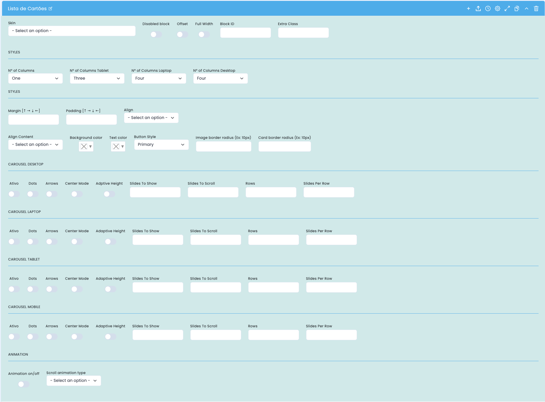
Advanced settings for the card list block.

This screen focuses on the basic block structure, the number of columns per device, the visual styles of the cards, and the carousel logic at each breakpoint.

Block structure

  • Skin , Disabled block , Offset , Full Width , Block ID , and Extra Class define the structural framework of the section.
  • These options help to fit the component onto the page and coordinate it with specific anchors, styles, or rules.

Columns by device

  • The number of columns , number of columns for tablet , number of columns for laptop , and number of columns for desktop define the grid density in each layer.
  • The greater the number of columns, the greater the need for short copy and visually consistent images.

Visual style

  • Margin , Padding , Align , and Align Content adjust the internal breathing room and organization.
  • Background color , text color , button style , image border radius , and card border radius refine the overall visual identity.

Carousel by breakpoint

  • Desktop, laptop, tablet, and mobile devices can have the carousel enabled or disabled independently.
  • Dots , Arrows , Center Mode , Adaptive Height , Slides To Show , Slides To Scroll , Rows , and Slides Per Row control navigation and density.

Main content configuration

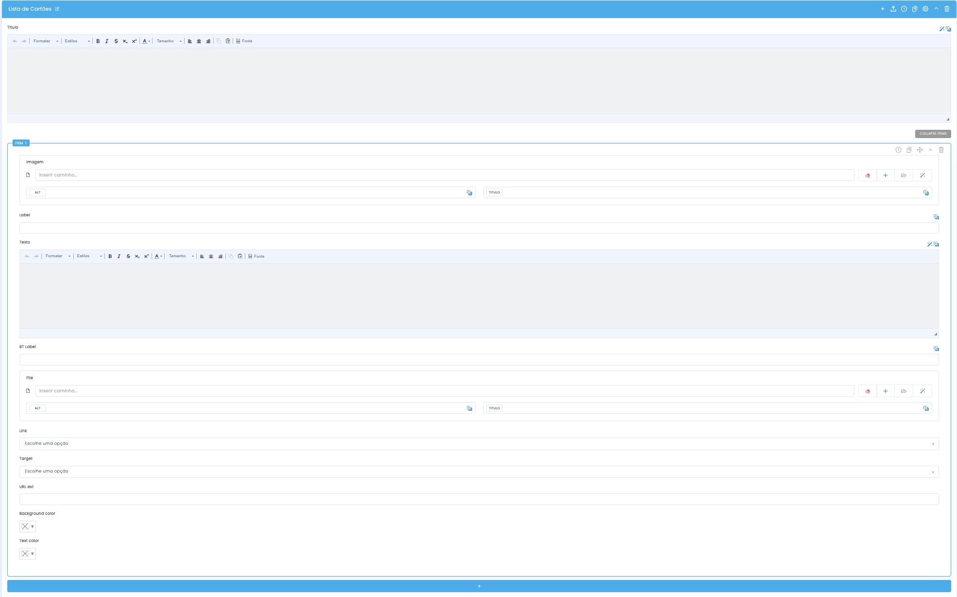
Section title, cards, file and links

Setting the content of the card list block

In the main configuration, you define the overall section title and, within each item, you organize the image, text, button action, supporting files, and card destination logic.

Section title

  • The Title field at the top serves as an editorial framework for the entire collection.
  • You should introduce the card collection and prepare the reader to examine the various items without overshadowing each individual piece.

Image and Label

  • Each card can include an image with ALT text and a TITLE , as well as a Label field to categorize the content.
  • It's important to maintain the same visual logic between images so that the grid appears cohesive.

Text, button, and file

  • The Text field summarizes the card's content, while the BT Label defines the main action.
  • The File field can be used to attach downloads, documents, or supplementary materials to the content.

Destiny and colors

  • Link , Target , and URL ext control the internal or external destination of the card.
  • Background color and text color allow you to visually adjust each item without losing contrast and readability.

Columns and carousel by device

Desktop, Laptop, Tablet and Mobile

Columns and carousel by device in the card list block.

The same collection can behave as a static grid or as a carousel, depending on the device. This fine-tuned control is important to preserve balance, readability, and navigation rhythm at each breakpoint.

Desktop

  • This is usually the breakpoint with the greatest capacity to display more columns or more slides simultaneously.
  • This is also where Rows and Slides Per Row can create denser compositions without compromising readability too much.

Laptop

  • It functions as an intermediate layer, useful for slightly reducing density compared to the desktop.
  • It is often worthwhile to review Slides To Show and Slides To Scroll to avoid overly compressed cards.

Tablet

  • On a tablet, protecting the text readability and the touch-sensitive navigation area is usually more important.
  • Adaptive Height can be helpful when different cards don't have the same amount of text.

Mobile

  • On mobile devices, it tends to make sense to reduce density and simplify the experience for a more linear reading experience.
  • If the carousel is active, it's advisable to confirm that Dots and Arrows are still useful and not just decorative.
Best practice: treat device settings as editorial decisions, not just technical ones. What works with four cards on a desktop may not work at all on mobile, even with the same content.

Related guides

Additional context for this block